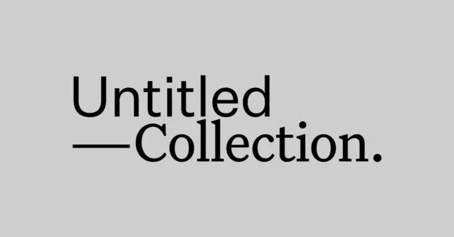
About Untitled Sans Font
I first tried Untitled Sans Font while working on a calm, text-heavy website for a cultural project. I needed something plain, honest, and sturdy, without any loud personality. This typeface kept appearing in references and case studies, so I finally gave it a proper test in my layouts.
What drew me in was how quiet it looks on the page. The design feels stripped back, almost anonymous, yet still carefully made. I used it in wireframes at first, then slowly promoted it to final designs. For that project, and for my tests for Free Fonts Lab, it became a neutral base to judge colour, spacing, and overall visual identity.
Font Style & Design Analysis
Untitled Sans Font is a pure sans-serif typeface with a very restrained voice. The shapes are clean, with simple curves and straight lines that never call attention to themselves. It feels like a tool, not a showpiece. On screen, the strokes look even and balanced, with no flashy details or dramatic contrast.
The designer is often linked to modern minimalist type practice, though exact credit can vary across sources, so I treat the designer as designer unknown in my notes. That said, the construction clearly follows the Swiss-inspired school of neutral typography. The font family feels considered, as if every weight aims to stay out of the way of the message.
The letterforms lean slightly narrow, which helps fit more text on a line without feeling cramped. Spacing is moderate and steady, giving a smooth reading rhythm in both headings and body text. The mood is cool, objective, and somewhat impersonal. This is a strength for functional layouts, but a limitation when a brand needs warmth or strong character. As a sans-serif, it shines in clear structure, not emotional storytelling.
Where Can You Use Untitled Sans Font?
I reach for Untitled Sans Font when I need typography to disappear and let content speak. It works well for editorial websites, documentation, product pages, and systematic design systems. In large sizes, headings look confident but not loud, perfect for teams that want order and clarity instead of a big stylistic statement.
In smaller sizes, this font family remains readable as long as spacing is handled with care. On high-resolution screens, it feels crisp in UI labels, menus, and captions. I would use it happily for dashboards, design systems, and apps where consistency matters more than uniqueness. For long paragraphs, a slightly higher line height keeps things airy and comfortable.
For pairing, I often match Untitled Sans Font with a warmer serif for contrast, especially in editorial or brand work. The neutral sans-serif structure provides a stable grid, while a more expressive display or serif typeface can handle titles or callouts. For very minimal brands, using multiple weights from this one font style can be enough to build a full, calm visual hierarchy.
Font License
The licensing for Untitled Sans Font can differ between sources, so I never assume it is free for client work. Always check the official provider for details on personal, commercial, desktop, and web use. When I plan to use it in a real project, I confirm the licence terms before sending any final files.
For me, Untitled Sans Font works best as a quiet, reliable tool when I want structure and neutrality. It will not carry a brand by itself, but it can give your layouts a clear, steady base to build on.


Leave a Reply