
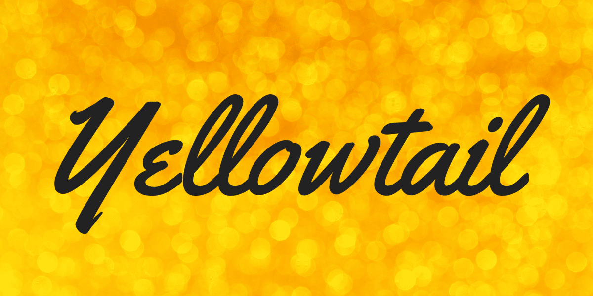

About Yellowtail Font
I first tried Yellowtail Font while building a warm header for a food blog. I needed something friendly, loose, and a bit nostalgic, but not messy. The bold, flowing strokes caught my eye, and the rhythm felt playful without turning childish. That mix made me stop and take a closer look.
I tested it across a few mockups for Free Fonts Lab to see how it behaved in real layouts. I wanted to know if this typeface could hold a brand voice, not just look nice in a single word. The more I used it, the more its easy, handwritten charm started to make sense.
Font Style & Design Analysis
Yellowtail Font is a handwritten script with thick, confident strokes and smooth loops. The letters lean forward slightly, which gives the typography a casual, energetic flow. It feels like a quick, skilled marker pen on a signboard, rather than a slow, careful calligraphy style. That energy shapes its whole visual identity.
The designer is widely credited as Astigmatic, known for practical, characterful display faces. You can see that approach here: it is not trying to be a perfect brush script. Instead, it aims to be readable, textured, and bold. The font family focuses on a single strong style, rather than a huge range of weights.
The letterforms have open counters and clear joins, which helps with legibility at medium sizes. Capitals are big and showy, great for starting words in logos or headlines. Spacing feels tight but controlled, so the words form a lively, connected line. The mood is friendly and informal, but not messy. As a handwritten font, it works best in short phrases; long paragraphs start to feel heavy and busy.
Where Can You Use Yellowtail Font?
I find Yellowtail Font shines in branding for cafés, bakeries, street food, or casual lifestyle projects. It has that sign-painter vibe, so it suits menus, chalkboard graphics, and packaging very well. Large titles, stickers, and banners are where this font style really shows its personality and bold curves.
In smaller sizes, the thick strokes can close in, especially on screens. I avoid using it for body copy or long captions. Instead, I keep it for headings, logos, and short taglines. Pairing it with a clean sans-serif typeface, like a neutral grotesque, helps balance the layout and keeps the typography easy to scan.
The typeface also works nicely in social media graphics, especially quote posts, sale announcements, and story covers. For young, relaxed audiences, it adds a friendly, human tone. I usually track the letters slightly looser for digital use, to let the letterforms breathe. In print, it sits well on textured paper, where the handwritten feeling becomes even stronger.
Font License
From what I have seen, Yellowtail Font is often shared as a free typeface, but licence terms can differ by source. Before using it in any commercial project, I always check the latest licence details from the official provider. That habit avoids confusion and protects both you and your client.
My personal takeaway: I reach for Yellowtail when I need bold, friendly handwriting that still reads clearly and holds a brand’s voice without trying too hard.


Leave a Reply