
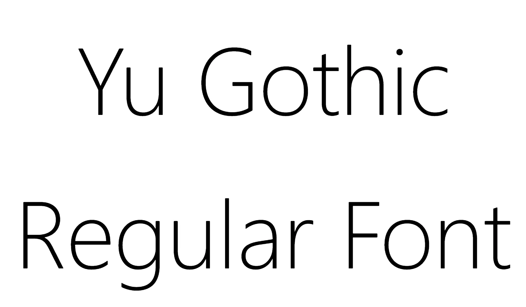

About Yu Gothic Font
I first turned to Yu Gothic Font while designing a clean interface for a Japan-focused app. I needed a typeface that could handle both Latin and Japanese text without feeling heavy or old-fashioned. The open shapes and calm texture caught my eye, so I decided to test it properly for Free Fonts Lab.
What drew me in most was the quiet balance. It looks modern, but it does not shout. I wanted something neutral enough for body text, yet clear enough for menus and labels. During testing, I tried it across different screen sizes and languages, just to see how far I could push this font family in daily design work.
Font Style & Design Analysis
Yu Gothic Font is a sans-serif typeface with a very controlled, tidy voice. The strokes feel even and smooth, with no extra decoration. It leans towards a contemporary, system-friendly look, which makes sense given how often it appears in modern interfaces. The overall appearance is clean, light, and quite neutral.
The exact creator information is hard to trace in regular design tools, so for practical purposes I have to treat the designer as unknown. What is clear, though, is that it was built for digital use first. The hinting on screen and the way the weight steps are planned suggest a focus on readability in user interfaces and software environments.
The letterforms show wide counters, simple terminals, and a steady rhythm between characters. Spacing feels slightly loose at smaller sizes, which helps legibility on low-resolution screens. In larger text, that same spacing can look a bit airy, so I often tighten tracking for headlines. As a sans-serif font style, it works well for calm, neutral typography, but it lacks the strong personality needed for expressive branding or loud posters.
Where Can You Use Yu Gothic Font?
I have found Yu Gothic Font most comfortable in UI design, app menus, and software dashboards. It behaves well in small sizes, especially on Windows systems where it is often available by default. For long paragraphs, it stays readable, but the texture can feel slightly plain in heavy reading experiences like articles or books.
At larger sizes, such as titles or section headings, I usually adjust tracking and weight. Medium or bold weights work better for visual hierarchy than the lighter ones. When I need more character in display text, I often pair this typeface with a warmer serif or a subtle display font, while keeping Yu Gothic for body copy and functional labels.
This font family fits brands and projects that want a quiet, modern, and somewhat technical feel. It suits software products, tech blogs, dashboards, and documentation. For layouts mixing Latin and CJK scripts, it does a solid job of keeping visual identity consistent. That balance makes it useful when you design multilingual interfaces or information-heavy screens.
Font License
The licence for Yu Gothic Font can vary depending on how you access it, such as through an operating system or specific software. Before using it in commercial work, you should always review the official licence terms from the source that provides the font. I treat it carefully and double-check usage rights for each project.
For my own practice, Yu Gothic Font remains a practical, quiet tool rather than a star of the show. When I need reliable on-screen clarity, especially in multilingual layouts, I know it can handle the job without drawing attention to itself.


Leave a Reply