
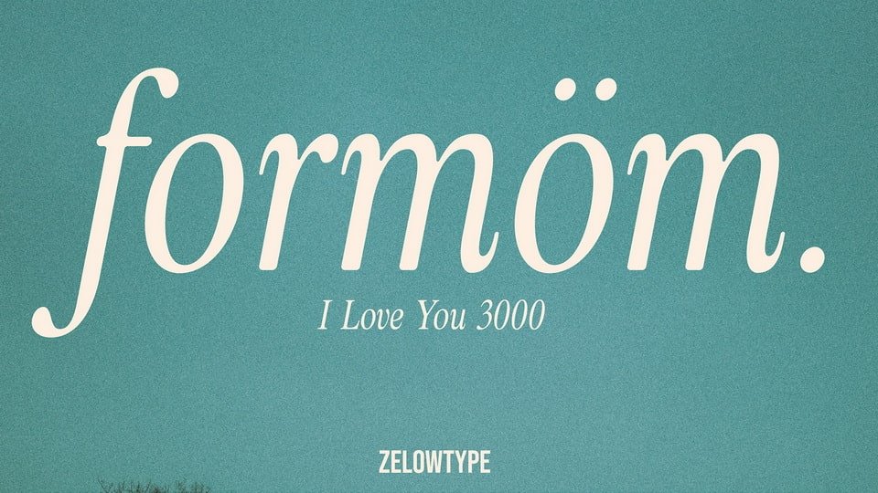

About Zt Formom Font
I was working on a soft, story-driven book cover when I tried the Zt Formom Font for the first time. I needed a serif that felt friendly but still mature, and this typeface caught my eye right away with its calm, generous shapes.
I tested it across headings, pull quotes, and small captions to see how it behaved in a real layout. The font looked consistent and steady, which matters a lot in print work. I later wrote some notes about it for Free Fonts Lab, because I felt other designers might face the same choices.
Font Style & Design Analysis
This is a serif font with a gentle, human tone. The curves feel round and open, while the serifs stay clear but not sharp. The overall impression is warm rather than strict, so the font style leans towards storytelling and editorial work instead of cold, corporate branding.
The exact creator of this font is listed as designer unknown in the sources I checked. That said, the decisions behind the forms feel quite deliberate. The font family shows a balance between classic book typography and a slightly modern voice, which suggests thoughtful, if quiet, design work.
The letterforms have wide counters, soft terminals, and enough contrast to stay readable on screen and in print. Spacing is relaxed, with a rhythm that feels slow and steady, not rushed. This gives text a calm pace, which suits long reading. The main limitation appears in very tiny body text, where the details of the serifs can start to blur on low-quality displays.
Where Can You Use Zt Formom Font?
In my tests, Zt Formom Font worked best in editorial and storytelling projects. Think children’s books, lifestyle magazines, personal blogs, or gentle brand stories. At larger sizes, like chapter titles or cover headlines, the serif details and curves show a nice personality without shouting.
At medium sizes, such as subheadings and pull quotes, the serif structure keeps the text stable and easy to scan. For long paragraphs, I would use it with generous line spacing. The relaxed rhythm helps the eyes move smoothly, especially in printed pieces aimed at families, education, or wellness audiences.
For pairing, I usually combine this serif with a clean sans-serif for captions or UI labels. A simple geometric or humanist sans can highlight the warmth of the serif shapes. I would avoid pairing it with very decorative scripts, as that can create visual noise and weaken the soft, steady voice of the main typeface.
Font License
From what I could find, the licence terms for Zt Formom Font are not fully clear for every use. Please treat personal and commercial projects with care, and always double-check the current licence details from the official source before you ship client work or large print runs. As Ayan Farabi, I prefer to stay on the safe side.


Leave a Reply