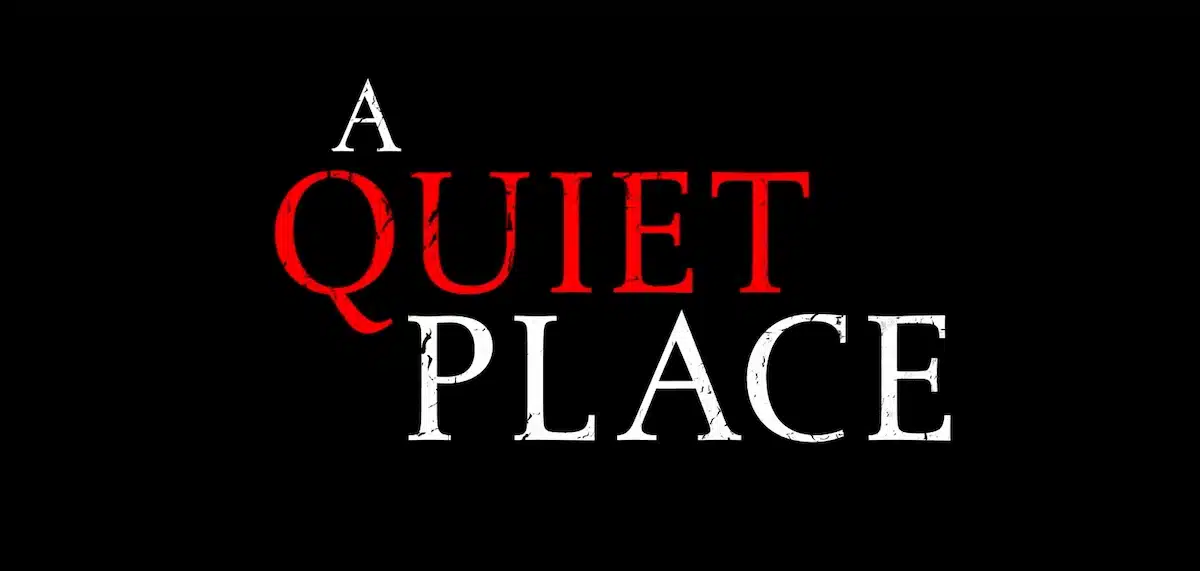
A Quiet Place Font Download
A Few Words About the A Quiet Place Font
Something about the A Quiet Place font is fascinating. Whenever I work with this typeface, I feel the same tension and stillness that shaped the film’s quiet world.
The spacing, the silence, and the atmosphere remind me why the A Quiet Place series became such a strong visual experience. The first time I saw the quiet place logo on the movie poster, I felt an instant connection to its calm intensity.
As a designer, I love fonts that speak softly yet remain powerful. This one caught my attention right away. The clean forms, the balanced spacing, and the quiet strength of each letter made me explore the font used in A Quiet Place.
When I learned it was Albertina, designed by Chris Brand and published by Monotype, I understood why it worked so well. Albertina carries a sense of control and elegance that matches a story where every sound is a threat.
Features of A Quiet Place Logo Font
The Albertina typeface has a strong mix of traditional and modern design. Its features give designers flexibility while keeping a unique visual voice.
Elegant Serif Structure
Albertina is a serif font with refined curves and gentle contrast. Every stroke feels intentional. It works well in both text settings and headline designs. The shapes create a quiet tension that suits thriller or post-apocalyptic visuals.
Thoughtful Spacing
One of its strongest features is the spacing. The letters have room to breathe, which fits a story based on silence. The spacing also improves readability and creates clear text even at small sizes.
Cinematic Sharpness
Sharp serifs and clean endings give the font a dramatic presence. When placed on an image, poster, or logo, the letters feel serious and stable. This sharpness helps create a strong visual effect.
Strong Visual Impact
Albertina holds its shape at large scales, which is useful for posters and movie title templates. The forms remain balanced whether you work on film artwork or simple graphic layouts.
Classic Inspiration
The font takes inspiration from traditional book typography. It still adapts well to modern design styles. This blend is perfect for creative projects that need both personality and clarity.
Multiple Weights and OpenType Features
Depending on the version you buy, you may get several weights and helpful OpenType features. These include:
- Ligatures
- Stylistic alternates
- Multilingual support
- Full punctuation set
These features make Albertina a reliable tool for branding, editorial layouts, and screenwriting-themed concepts.
Trusted Origin
Since it was designed by Chris Brand and produced by Monotype, the font has professional quality and a clean file history. This makes it safe for long-term design use.
Where Can You Use the A Quiet Place Font?
Albertina is flexible and works well in many creative projects. Here are some ideal uses.
Movie and Thriller Designs
This font is perfect for visual projects inspired by horror, thriller, or post-apocalyptic world themes. It carries the right mood for stories in which silence, sound, emotion, and tension define the atmosphere. It reflects the same feeling that surrounds the creatures in the movie.
Logos and Branding
Its sharp letterforms bring elegance to logo design. Brands that need a strong yet quiet presence can benefit from this style. It works well for headlines and taglines, too.
Posters and Visual Templates
Since the font was used in the film’s logo and poster, you can easily create similar designs. A poster generator or a design tool makes experimentation smooth and enjoyable.
Editorial and Print
The font is readable and feels polished in magazines and books. It pairs nicely with a clean sans serif for body text.
Creative Graphic Projects
You can generate text for atmospheric titles, film-inspired designs, or tense visuals. The font supports layouts that explore silence, stillness, and emotional storytelling.
A Quiet Place Font Free Alternatives
If you prefer not to purchase Albertina, you can still achieve a similar look. Here are some free fonts you can download:
- Thryromanes by Herman Miller.
- Aver by Lauren Thompson.
- Doulos by SIL International.
- Wensley by Faraz Ahmad.
- The Queen by Font Bundles.
These fonts share similar shapes and moods. They are good options for creating A Quiet Place font-inspired graphics.
Font License
Albertina is a commercial font. You must buy the font to use it legally. You can find the official purchase and font download link from Monotype. Free alternatives above may have different rules for personal or commercial use, so check each license carefully.
What is the easiest way to install this font on my device?
There’s no reason to be worried. Please follow our directions.
You may also find out more about typography and how it is classified from here.
Please do not hesitate to contact me if you have any questions. Thank you very much!


Leave a Reply