

American Eagle Font Download
Few Words About the American Eagle Font
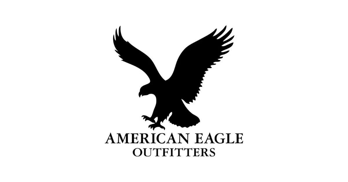
The American Eagle font has always reminded me of bold and confident branding. When I first studied the American Eagle logo font, I loved how strong and stylish the letters looked.
The clean serif shapes, the classic tone, and the modern energy made me pay attention. This typeface has a timeless appearance that fits the American style perfectly and works beautifully in digital and print projects.
What drew me to this font was its balanced mix of elegance and strength. The sharp serifs, clear curves, and thick forms create a powerful visual identity. The Azuza Bold typeface, which is the official American Eagle font, has a strong structure that feels iconic.
As a designer, I enjoy fonts that bring personality to a brand. This one does it with confidence. Whether you study clothing labels, packaging, or online graphics, the logo design reflects a clean and classic serif style that feels both modern and warm. It is no surprise that many eagle fonts and American eagle outfitters inspired projects still reference this look today.
Features of the American Eagle Font
The official American Eagle typeface is Azuza Bold, designed by Jim Parkinson and released through Parkinson Type Design in 2014. Here are the main features that set it apart.
1. Bold and Confident Serif Style
Azuza Bold is a serif typeface with strong forms. The letters use thick strokes and sharp serifs. This gives the font a bold and confident presence. It works well for brands that want to show strength and clarity.
2. Sharp and Clean Letterforms
Each letter has crisp shapes and smooth curves. The uppercase letters feel very structured. This results in a clean and timeless look. The font shows beautiful contrast between thick and thin strokes. This improves readability even at medium sizes.
3. Elegant Classic Appearance
Azuza Bold has an elegant tone. The style feels classic but still appropriate for modern digital work. I enjoy the balance between tradition and modern design. It gives designers flexibility in different types of projects.
4. Strong Visual Impact
Because the font uses thick and heavy strokes, it stands out in a graphic or logo. It is perfect for projects that need a memorable and iconic appearance. The letters create a unique visual rhythm that is easy to recognize.
5. Works Well in Digital and Print
Azuza Bold performs well in both digital and print environments. The shapes are smooth, and the spacing is regular. This makes it suitable for clothing tags, packaging, online banners, and many design projects.
6. Free Font Alternative Available
A very good free alternative to the American Eagle font is Volkhov Regular. This serif typeface was designed by Cyreal in 2011. It comes with a freeware license for non-commercial work.
You can download it, install it in Adobe Photoshop or any other graphics program, and use it to create a unique American Eagle Outfitters inspired logo. It does not match Azuza Bold exactly, but it offers similar elegance.
Where Can You Use the American Eagle Font?
Azuza Bold and its alternatives work in many design situations. Here are the places where this style is most effective.
1. Logo Design
This font shines in logo design. The strong letters and sharp serifs give a brand a powerful identity. It is great for clothing brands, lifestyle brands, or companies that want a clean and confident logo.
2. Packaging
The classic serif shapes look elegant on product packaging. The font adds a premium feeling. It works nicely on boxes, tags, and labels.
3. Clothing and Fashion Graphics
The American Eagle brand uses a strong serif letter style to match its clothing line. Designers can use the same approach when creating apparel graphics or brand templates.
4. Digital Graphics
The font looks great in digital images, advertisements, and website headers. The thick strokes make it easy to read on screens. It remains stable at different sizes.
5. Print Projects
Because the contrast and curves are clean, the typeface performs well in printed materials. This includes posters, brand manuals, brochures, and flyers.
6. Creative Projects
If you want to create an elegant or stylish text design, this typeface is a solid choice. It mixes strength and aesthetic charm. Designers often choose it when they need a tone that feels both classic and modern.
7. Branding Templates
Azuza Bold works very well in a brand’s typography system. It can be paired with simple serif fonts or clean sans serifs to create harmony. For body text, a softer serif font like Volkhov Regular pairs well.
Font License
Azuza Bold is a commercial font. You must purchase a license from Parkinson Type Design or an authorized distributor to use it in professional design projects. Volkhov Regular is a free font alternative for personal and non-commercial use. You can download it from trusted free fonts platforms and use it in Adobe or other editing software.
What is the easiest way to install this font on my device?
There’s no reason to be worried. Please follow our directions.
You may also find out more about typography and how it is classified from here.
Please do not hesitate to contact me if you have any questions. Thank you very much!


Leave a Reply