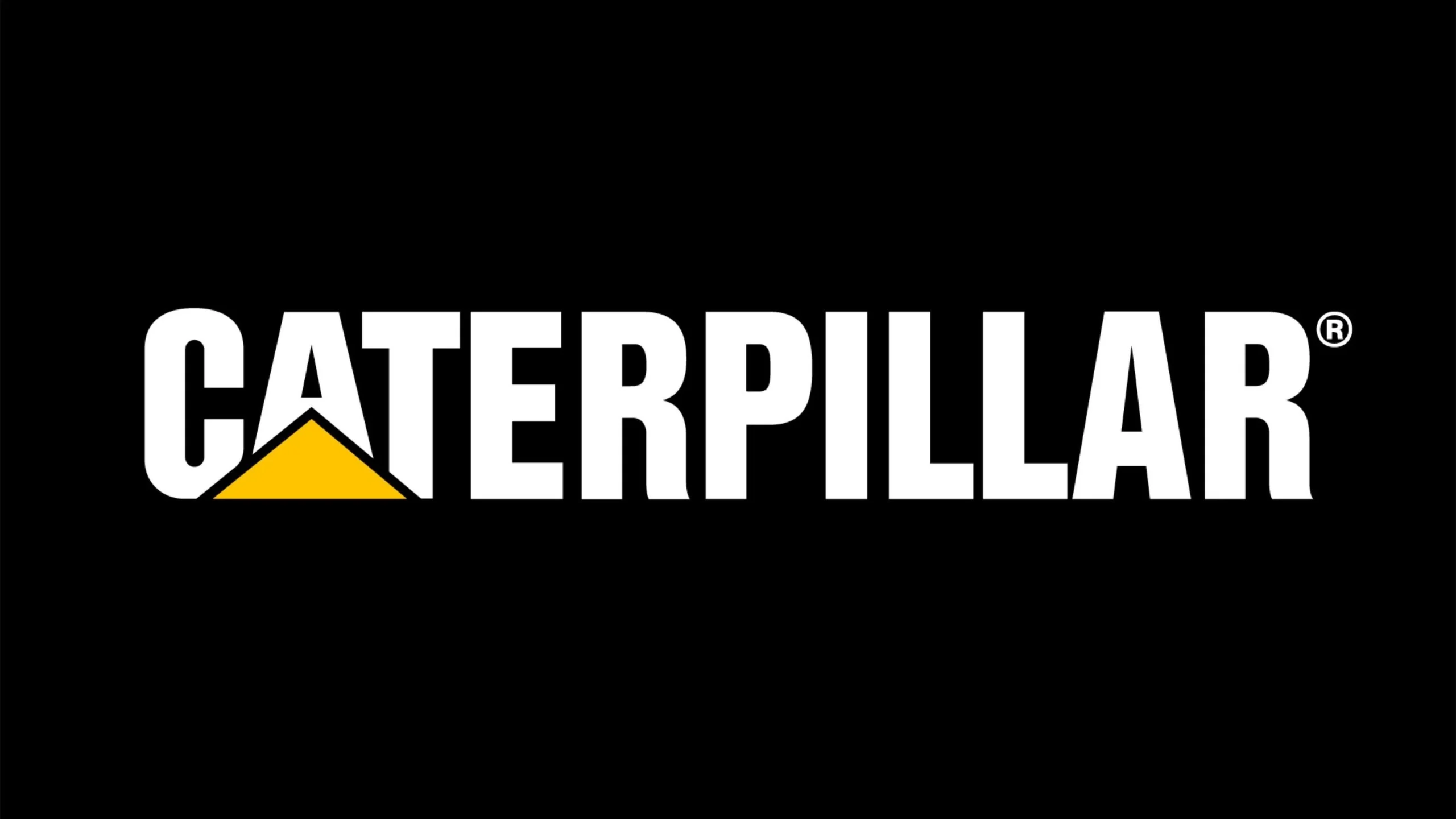
Caterpillar Logo Font Download
Note: To use this font for commercial purposes, click “Buy Commercial Version” Button!
A Few Words About the Caterpillar Font
The Caterpillar Font caught my attention the moment I saw it. It feels strong, bold, and full of character. When I look at the Caterpillar logo font, it immediately reminds me of the heavy machinery industry. The design communicates power, stability, and trust, which reflects the spirit of Caterpillar Inc. very well.
What made me explore this font was its simple and modern look. It is clean, clear, and easy to work with. The typeface used in the Caterpillar logo is Helvetica Bold, designed by Max Miedinger and Eduard Hoffmann in 1957. It is a classic sans-serif typeface that has shaped modern typography. Over the years, Helvetica has become an iconic choice for many global brands. Its strength and clarity explain why the Caterpillar design team selected it to represent their brand.
Features of Caterpillar Logo Font
The Caterpillar Font is based on Helvetica Bold, and it offers a range of features that make it reliable for design work. Here are the key details explained clearly.
1. Strong Swiss Design Roots
Helvetica was created in Switzerland, a place known for clean, neutral design. The font is geometric, balanced, and very readable. These qualities make it suitable for brands that want clarity and confidence.
2. Bold and Clear Letter Shapes
The Caterpillar logo uses the bold weight of Helvetica. The thick strokes of each letter create a powerful look. This bold style stays readable even on large machines, labels, or distant signs. The letters appear solid and confident, which matches the rugged nature of Caterpillar’s products.
3. Simple Modern Sans Serif Style
Since Helvetica lacks serifs, the design feels modern and smooth. The simple shapes make the font versatile for many design jobs. It works well in logo design, product packaging, and branding because it avoids visual noise and focuses on clarity.
4. Unique Yellow Triangle Symbol
The Caterpillar logo includes a bright yellow triangle placed under the letter A. The colour yellow represents visibility, energy, and safety. These qualities are very important in the machinery industry. The triangle also gives the logo a forward-moving feel, adding a strong visual identity to the brand.
5. Easy to Pair with Other Fonts
Helvetica works well with many other typefaces. Designers often match it with serif fonts in magazines or with lighter sans-serif fonts in websites. This makes the Caterpillar font flexible for different brand identities.
6. Multiple Weights and OpenType Features
The full Helvetica family offers many weights, from Thin to Black. It also supports multiple languages and includes useful OpenType features. This allows designers to create consistent visuals in both digital and print formats.
Where Can You Use the Caterpillar Font?
The Caterpillar Font has a bold, modern style, making it suitable for many design projects. Here are the best places to use it.
- Logo Design: Great for brands that want a strong and trustworthy look. Perfect for engineering, machinery, automotive, and industrial companies that need a bold and effective identity.
- Product Labels and Packaging: Works well on heavy-duty tool packaging, machinery labels, or industrial product boxes. The bold style is easy to read in tough conditions.
- Editorial and Print Design: Suitable for magazines, brochures, business reports, or promotional material that needs clear and confident typography.
- Web and UI Design: The clean sans serif shapes remain readable on websites, apps, and digital dashboards.
- Brand Identity Systems: When paired with softer fonts like Open Sans or classic serif fonts like Georgia, Helvetica creates a balanced and professional brand style.
Font License
The Helvetica font used in the Caterpillar logo is free for personal use.
If you want to use it for commercial work, you must contact the font author or the official distributor to purchase a proper license. You can find safe and trusted download links on Free Fonts Lab. you, Mr Darcy’s got more than 136 unique alternatives for each character! This font has character diversity that adds a lot of flexibility to any design project.
This font isn’t just all about looks; it’s super functional too. Whether you’re working in Adobe Illustrator, Adobe InDesign, Adobe Photoshop, CorelDRAW, or even Quark, Mr Darcy font has got your back with all OpenType features.
What is the easiest way to install this font on my device?
There’s no reason to be worried. Please follow our directions.
You may also find out more about typography and how it is classified from here.
Please do not hesitate to contact me if you have any questions. Thank you very much!


Leave a Reply