

Family Feud Font Free Download
Note: To use this font for commercial purposes, click “Buy Commercial Version” Button!
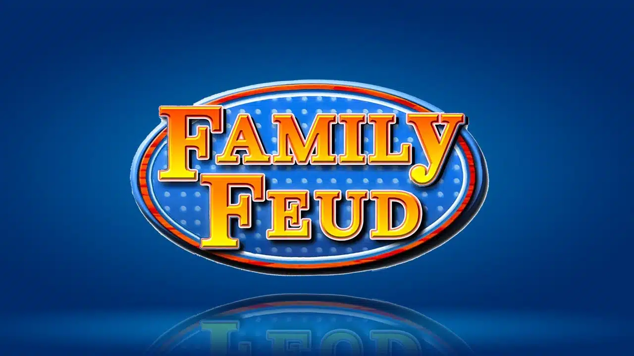
Few Words About the Family Feud Font
The Family Feud font has always fascinated me for its bold, friendly, and nostalgic charm. As a designer, I often look for fonts that carry personality, and this one instantly reminds me of the popular American game show where two families compete to guess the most popular answers.
The show’s logo, with its confident serif letters and bright style, perfectly captures that spirit of fun and competition. I wanted to explore what made it so distinctive, and what font families could recreate that feeling for modern use.
The Family Feud logo is primarily based on Clarendon Bold, a slab serif font designed by Hermann Eidenbenz in 1953. This typeface has become a timeless classic in typography, known for its thick serifs, geometric balance, and traditional yet energetic design. However, since Clarendon Bold is a commercial typeface, not everyone can easily use it.
For that reason, I recommend the Fontsbird Family Feud Font, a free version inspired by the original Clarendon Bold style. It captures the same bold curves, solid forms, and friendly rhythm, making it perfect for designers who want that game show aesthetic without licensing restrictions.
Features of the Family Feud Logo Font
Classic Slab Serif Design
The Family Feud Font (based on Clarendon Bold) belongs to the slab serif family. It features strong rectangular serifs, smooth transitions, and balanced strokes. This gives the letters a mix of confidence and friendliness that instantly stands out in logos, posters, or show graphics.
Bold and Consistent Letterforms
Each character in the font has a uniform stroke weight that gives the text visual stability. The boldness adds impact, making it perfect for large displays, headers, or logos. Whether used in print or on screen, the letters maintain clarity and presence.
Distinctive “All Caps” Look
The Family Feud logo is famous for its all-caps style, with one charming detail, the lowercase “y” that breaks the pattern. This playful twist adds personality to the logo. You can easily recreate this look using the Fontsbird version by keeping all letters uppercase and only making the “y” lowercase.
Great Readability Across Sizes
The thick strokes and open spacing make the font readable even at smaller text sizes. It performs well in both text and image formats, such as video graphics, web banners, and PNG templates. The structure of the letters ensures consistent clarity whether viewed on a big TV screen or a mobile device.
Traditional Yet Modern Feel
Clarendon Bold’s classic design brings a traditional serif touch, while the modern adaptation by Fontsbird gives it a smooth digital finish. This balance makes it versatile for both vintage-themed and contemporary designs. The rounded serifs and balanced proportions reflect timeless craftsmanship.
Free Version from Fontsbird
If you want to use this style without buying a license, the Fontsbird’s Family Feud Font is an excellent option. It closely follows the look of Clarendon Bold, allowing you to design creative materials inspired by the Family Feud logo without worrying about commercial licensing fees for personal projects.
Multilingual Support and OpenType Features
The Fontsbird version supports extended Latin characters, allowing multilingual use. Depending on the version, you may also find ligatures, alternate symbols, and other OpenType features useful for graphic and branding work.
Where Can You Use the “Family Feud Font”?
This font shines wherever you need energy, friendliness, and visual impact. It fits perfectly into designs that evoke fun, family, and entertainment.
Logo Design
The Family Feud Font is ideal for logos that need a welcoming and bold presence. Its thick slab serifs create a confident and approachable look, perfect for brands or projects inspired by games, media, or classic TV.
Game Show and Video Graphics
If you are designing layouts for a game show, quiz, or interactive video, this font will instantly give your project that Family Feud–style excitement. The strong forms hold up beautifully in moving text, banners, and title cards.
Posters, Flyers, and Print Design
The heavy letterforms and geometric shapes make it ideal for posters, flyers, and event graphics. It looks great when combined with bright colors, gradients, or glowing effects, similar to the show’s iconic backdrop.
Web and Social Media Use
The Fontsbird version of the Family Feud Font is optimized for web use. It works well for:
- Website headers.
- Interactive quizzes.
- YouTube titles.
- PNG template.
- Game-themed social media posts.
The letters remain clear and crisp even when scaled down, which is ideal for digital visuals.
Family-Friendly Branding
This font also fits branding projects that aim to feel traditional yet joyful. It works well for family entertainment brands, toy packaging, or community events where warmth and familiarity are essential.
Font Pairing Suggestions
To balance its strong presence, pair the Family Feud Font with simple, modern typefaces like:
- Montserrat for body text.
- Poppins for clean UI design.
- Lato for web layouts.
- Merriweather for editorial work.
These combinations create a nice contrast between playful headlines and readable paragraphs.
Font License
The original Clarendon Bold is a commercial typeface designed by Hermann Eidenbenz in 1953. It requires a license for professional or client-based work.
However, if you want a free version that captures the same visual style, the Fontsbird Family Feud Font is available for personal and free use. You can download it from here as a free download. Always double-check the license before using it for commercial purposes.
What is the easiest way to install this font on my device?
There’s no reason to be worried. Please follow our directions.
You may also find out more about typography and how it is classified from here.
Please do not hesitate to contact me if you have any questions. Thank you very much!


Leave a Reply