

Longlegs Font Download

A Few Words About the Longlegs Font
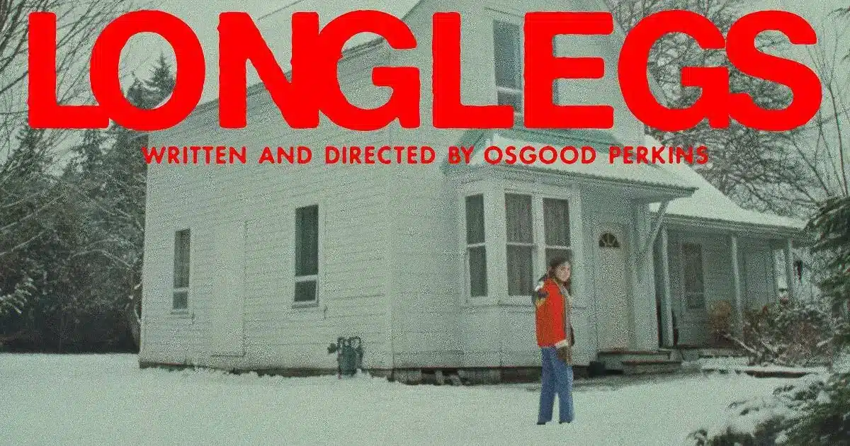
The Longlegs Font caught my attention the moment I saw the bold, unsettling style used in the Longlegs film poster. As someone who loves exploring horror typography, I felt an instant connection to its sharp personality and modern tension.
The combination of clean shapes and eerie atmosphere makes this typeface perfect for anyone who wants a font that feels dark, dramatic, and cinematic. I was especially drawn to how well it works in text, logo design, and poster layouts, which inspired me to explore it more deeply.
The film Longlegs is an upcoming American horror thriller written and directed by Osgood Perkins. It features Maika Monroe, Nicolas Cage, Alicia Witt, and Blair Underwood.
The poster uses Alte Haas Grotesk Bold, a typeface with strong visual weight and clean forms. That look convinced me to experiment with the Longlegs Font for some of my own art and design projects.
Features of the Longlegs Font
1. Bold Grotesque Aesthetic
The Longlegs Font follows a bold, clean, grotesque style. This gives it a modern appearance that feels serious and cinematic. Even though it looks simple, each character is carefully shaped and balanced.
2. Clear and Consistent Letterforms
Each letter is designed to feel stable and uniform. The structure, spacing, and size work well together, making the font reliable for headlines and mid-size text.
3. Strong Impact for Horror Themes
The movie has a psychological and eerie tone, and the font mirrors that mood. It does not use extreme distortions. Instead, it creates tension through minimalism, a powerful tool in horror design.
4. Great for Logos and Posters
Because the font is bold and clean, it works beautifully for logos, film titles, and promotional posters. If you want something similar to the Longlegs film font, this style gives you the strength and clarity needed for dramatic visuals.
5. Good for Digital Use
The simple structure helps the font stay sharp on screens. Whether you browse through digital layouts or export completed artwork, the quality remains consistent.
6. Easy to Download and Install
The font is available in popular free font collections so that you can download it quickly. The file is small and installs easily, making it a convenient choice for designers who want a fast and effective tool.
7. Ideal for Creative Exploration
The minimal design gives you room to experiment. You can pair it with textures, colour grading, or thriller-inspired imagery. It works well for personal projects and artistic concepts.
Where Can You Use the Longlegs Font?
The Longlegs Font works best for projects aiming for a dark, dramatic, or cinematic feel. Here are some ideal uses:
- Film posters for horror, thriller, or mystery stories.
- Title designs inspired by psychological films.
- Logos for eerie or suspense-driven brands.
- Social media graphics for spooky content or film promotion.
- Book covers involving crime, suspense, or supernatural elements.
- YouTube thumbnails for movie reviews or true-crime topics.
- Personal projects exploring mood, atmosphere, or storytelling.
- Typography experiments focused on bold simplicity.
To create balance, pair the Longlegs Font with a thin sans-serif or a soft serif. This contrast helps the bold title stand out while keeping the overall design clean and readable.
Font License
The Longlegs Font, represented by Alte Haas Grotesk Bold in the film poster, is free for personal use only.
For commercial use, you must review the official license. The original designer may reserve some rights, so always confirm usage permissions before publishing or distributing your work.
What is the easiest way to install this font on my device?
There’s no reason to be worried. Please follow our directions.
You may also find out more about typography and how it is classified from here.
Please do not hesitate to contact me if you have any questions. Thank you very much!


Leave a Reply