

Few Words About the Snap On Font
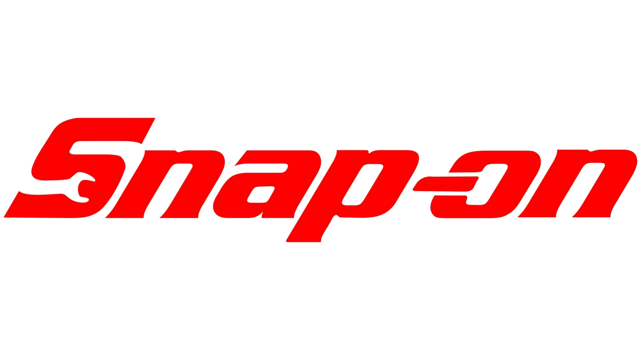
I still remember the first time I noticed the Snap On Font on a classic snap-on logo printed on a metal toolbox in an old garage. The sharp curves, bold slant, and confident style immediately drew my attention.
As a designer who pays close attention to typography and logo fonts, I felt connected to its strong visual personality. It looked powerful, precise, and built to last, much like a well-crafted wrench or socket from Snap-on Tools.
What impressed me even more was the story behind Snap-on. Snap-on Incorporated, founded in 1920, became a leading global designer, manufacturer, and marketer of tools, equipment, and diagnostics.
The company built its reputation on high-quality craftsmanship, commitment to innovation, and strong reliability. With operations across more than 130 countries, Snap-on serves both professionals and enthusiasts in the automotive, aviation, and industrial fields. Its logo and typography carry a long legacy in the world of mechanics.
The font used in the Snap-on logo is Serpentine EF Bold Italic, a powerful display typeface that fits perfectly with the brand’s energetic visual identity. The well-known red rectangle behind the text gives the logo an even stronger presence, making it a recognizable trademark worldwide.
Features of Snap On Logo Font
The Snap On Font, based on Serpentine EF Bold Italic, offers strong design qualities that make it perfect for bold, industrial branding. Here are the features I appreciate most.
1. Strong and Dynamic Style
The typeface uses a bold italic structure that gives every letter a sense of movement. It communicates energy and confidence, which works well for tough, professional branding.
2. Signature Serpentine Curves
The angled cuts, sharp edges, and clean inner curves create a mechanical look. This style fits perfectly with snap-on tools, repair, and equipment-focused themes.
3. Industrial Personality
The font feels rugged and technical. It fits naturally into environments involving tools and equipment, diagnostics, and hands-on repair work. Its form reflects the precision found in engineered parts.
4. Strong Visual Presence
The italic slant and thick strokes make the font easy to read in large formats. It works well for logos, signage, and posters that need to grab attention quickly.
5. Clean and Balanced Geometry
The consistent stroke weight and thoughtful spacing give the font a sense of quality. It shows the same durability and excellence that Snap-on products are known for.
6. Ideal for Branding
Its angular, aggressive design makes it a favorite for brands related to automotive, aviation, and industrial markets. It delivers a strong professional image.
7. Multiple Digital Formats
Designers can find it in several file types, including vector formats and PNG previews. These versions are useful for creating name plates, logo recreations, and marketing materials.
Where Can You Use the Snap On Font?
I have used this typeface in many projects, and it always performs well in bold and high-impact design work. Here are the best places to use it.
1. Logo Design
The Snap On Font is perfect for strong, technical, and industrial logos. Ideal for:
- Automotive shops.
- Mechanics and garage services.
- Tool and equipment brands.
- Industrial companies.
- Engineering and aviation services.
2. Posters and Marketing Materials
The slanted letters add a feeling of speed. It works well for event posters, product promotions, and anything related to strength or performance.
3. Packaging Design
Great for tool boxes, hardware packaging, and products where toughness and durability need to be shown instantly.
4. Editorial Titles and Headlines
Useful for:
- Magazine titles.
- Section headers.
- Catalogs for tools or machinery.
- Brochures and product sheets.
5. Digital and Online Design
It can enhance:
- Website banners.
- Social media graphics.
- Digital ads.
Font Pairing Tips
Use a clean sans-serif font like Helvetica, Inter, or Roboto for body text. This creates a balanced and readable design.
Font License
The Snap On Font (Serpentine EF Bold Italic) is a commercial font. It is not free for commercial use. Free versions or similar alternatives may exist for personal use. Always check the license before using it in business projects.
What is the easiest way to install this font on my device?
There’s no reason to be worried. Please follow our directions.
You may also find out more about typography and how it is classified from here.
Please do not hesitate to contact me if you have any questions. Thank you very much!


Leave a Reply