
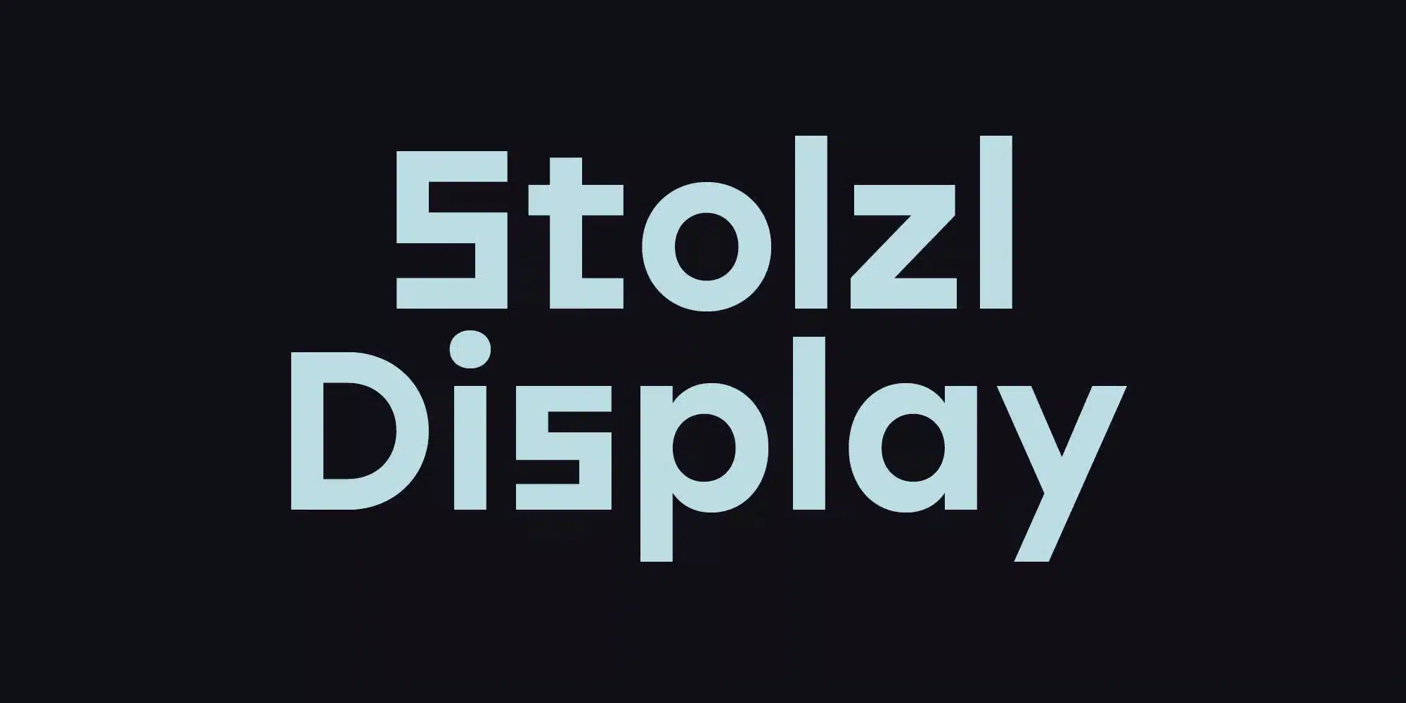

Looking for a display font that makes a bold statement? Check out Stolzl Display. This original font family has a cool, minimalist look inspired by the Bauhaus style.
Stolzl Display is easy to read and has an artistic edge. Whether you need a font that grabs attention on a poster or website header, Stolzl Display delivers a modern style based on timeless design ideas.
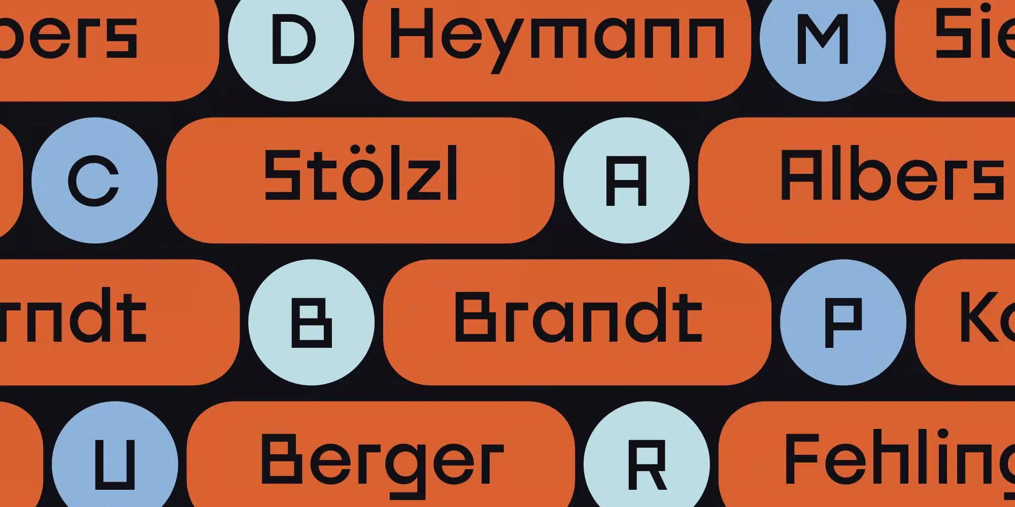
I recently used Stolzl Display for a website header and some printed posters promoting an upcoming event. This font was perfect for grabbing attention with its thick, blocky letterforms and minimalist style.
You can download this modern, Bauhaus-inspired font by clicking the button below.
Designers: Mariya Lish.
Works on PC & Mac.
Stolzl Font Download
Features of Stolzl Display Font
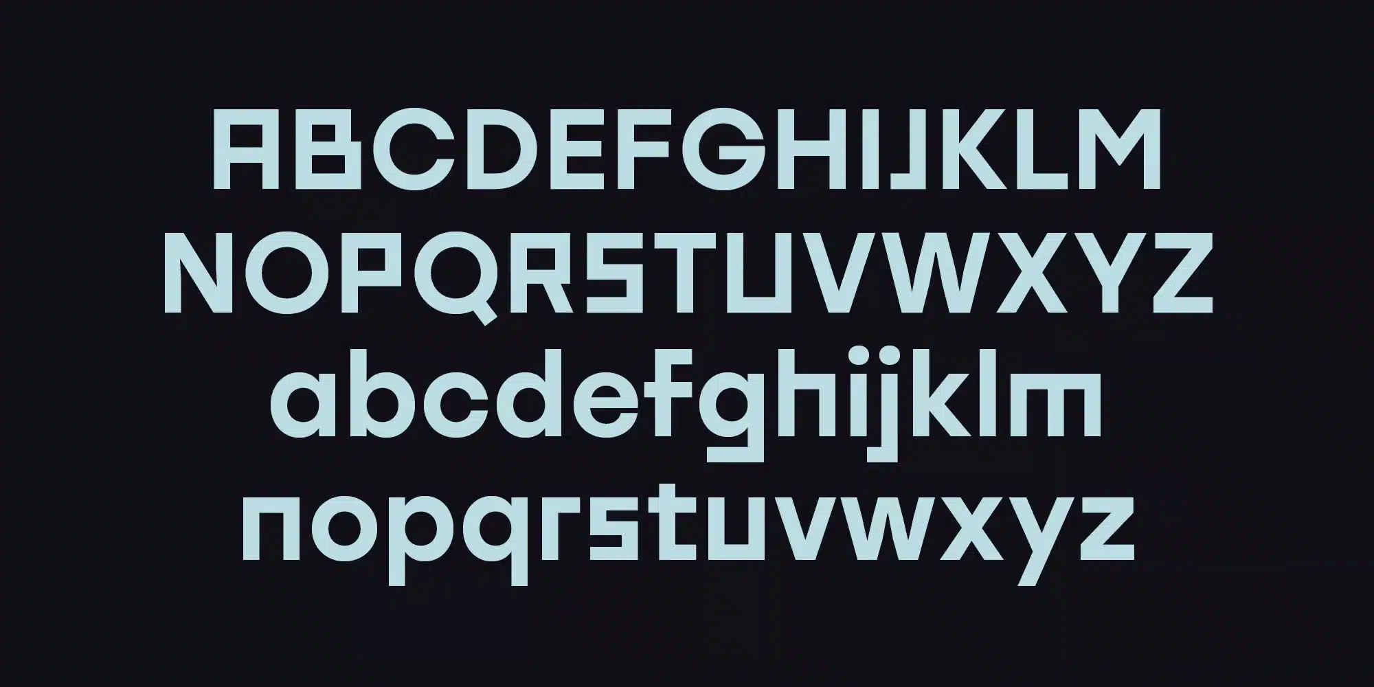
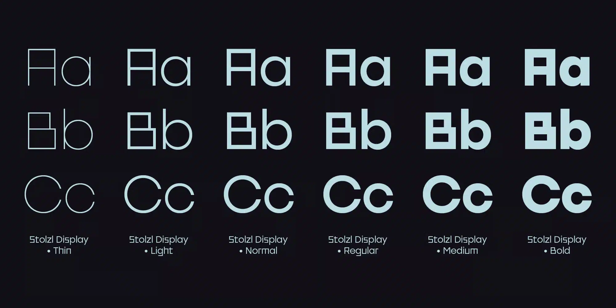
Stolzl Display offers great features for designers. The wide range of font weights, from thin to black, gives you flexibility. You can choose subtle or bold styles to fit your design needs.
The condensed letterforms maximize visual presence without clutter. This makes the Stolzl Display ideal for impactful headers, logos, and posters. You can make a statement and keep the text easy to read.
The tall x-height helps draw attention and create a visual hierarchy. Alternate letterforms provide unique customization options as well.
Manually edited kerning ensures excellent letter spacing and legibility. OpenType features give access to advanced styling like small caps, fractions, and more.
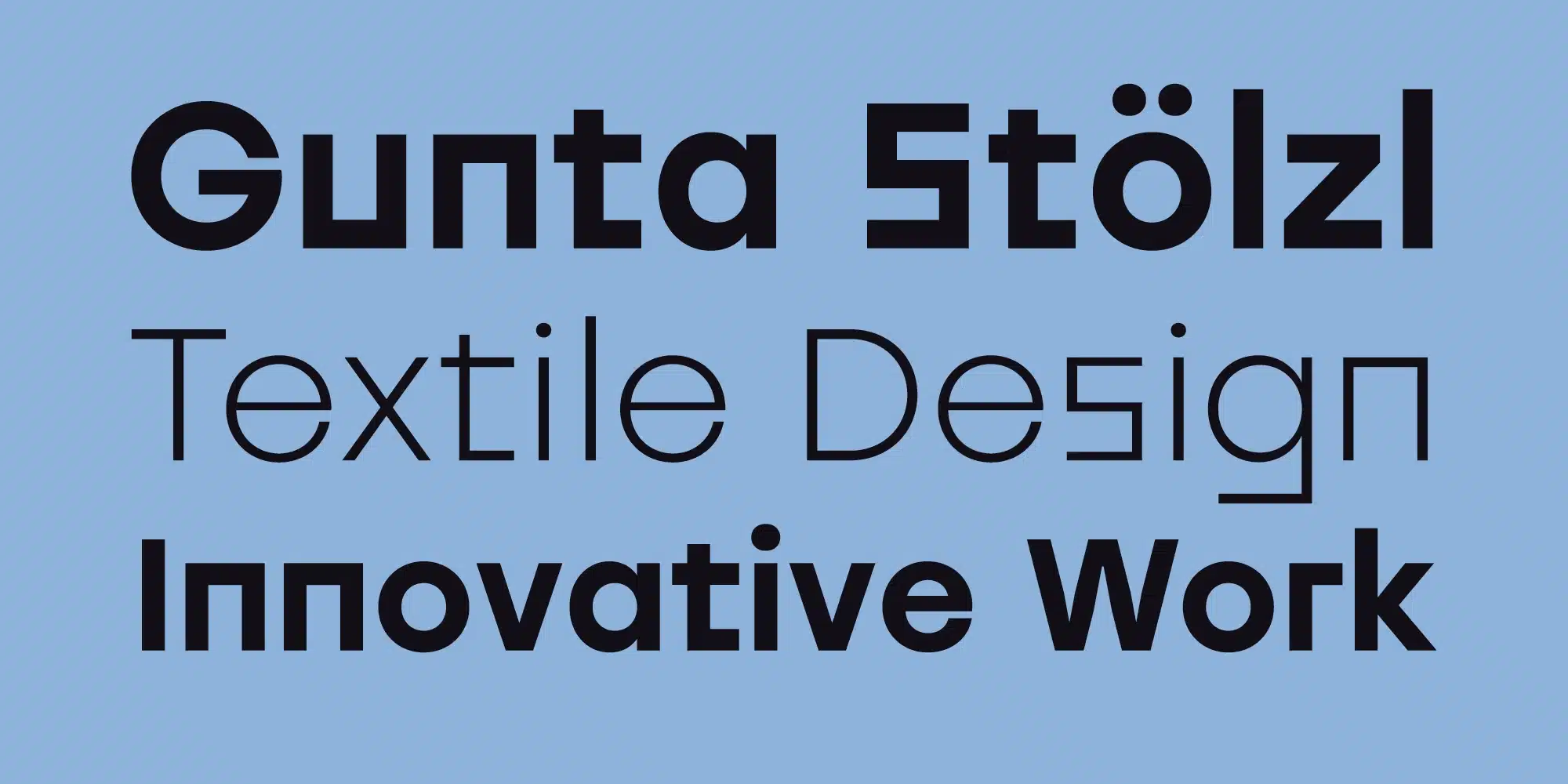
Overall, Stolzl Display truly empowers designers through thoughtful features. The array of weights, compact letters, OpenType support, and custom spacing enhances creative possibilities. Whether you want a retro Bauhaus feel or a current minimalist look, Stolzl Display offers the tools to elevate your work. I loved how these clever details took my designs to the next level.
Where Can You Use the Stolzl Display Font?
Here are some ideas for where you can use the Stolzl Display font:
- Website Headers – The bold, attention-grabbing styles of Stolzl Display are perfect for website headers, titles, and branding elements.
- Posters – With its high visual impact, Stolzl Display works great when you need to grab attention on posters, flyers, and print ads.
- Logos – The geometric letterforms and minimalist look of Stolzl Display lend themselves well to modern, stylish logos.
- Packaging – Use Stolzl Display for bold, clear product names and details on packaging and labels.
- Presentations – Stolzl Display offers legible but eye-catching header styles for PowerPoint presentations and slide decks.
- Books/Magazines – The artistic vibe of Stolzl Display makes it a good font for magazine covers, chapter titles, and headers in books.
- Apparel – Try using Stolzl Display for statement-making quotes, phrases, and names on apparel and merchandise.
- Retail Signage – The tall x-height allows Stolzl Display to stand out even from a distance on retail displays and signage.
With versatility across print and digital applications, Stolzl Display can grab attention wherever you need it – on both main titles and smaller supportive text.
If you want to learn more about the usage of display fonts like this, click here.
Font License
This is a PREMIUM FONT.
What is the easiest way to install this font on my device?
There’s no reason to be worried. Please follow our directions.
You may also find out more about typography and how it is classified from here.
Please do not hesitate to contact me if you have any questions. Thank you very much!


Leave a Reply