

True Religion Font Download
Few Words About the True Religion Font
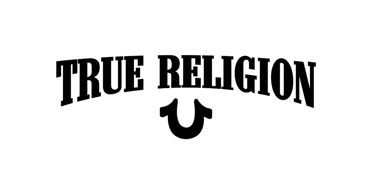
The True Religion font has always stood out to me because of its bold personality and classic American denim attitude. Each time I look at the True Religion logo on a pair of premium jeans, I feel the strength and uniqueness that the brand communicates through its typography.
The combination of serif shapes, strong lines, and a powerful logo style is what first inspired me to explore the design more deeply. The true religion symbol, the text arrangement, and the iconic look all create a beautiful connection between typography and fashion.
I was especially drawn to this typeface because of how well it reflects the identity of the clothing company. The logo lettering looks sharp, confident, and memorable. It works perfectly with the brand’s rugged but stylish image.
The type used in the True Religion logo brings a sense of quality and heritage. As a designer, I always enjoy exploring fonts that become symbols of culture. True Religion’s logo design is a great example of how typography can shape a brand’s full personality.
Features of the True Religion Font
The official True Religion logo font is Neo Contact, designed by American Type Founders (ATF). Here are the features that make this typeface so special.
1. Strong Serif Letterforms
Neo Contact uses sharp serif details that give each letter a bold and classic look. The serifs feel powerful without being too heavy. This creates an iconic style that fits premium denim products.
2. Balanced Typeface Structure
The letters have carefully crafted curves and balanced shapes. This balance helps give the font a clean but unique character. The structure makes the font easy to read in both small and large sizes.
3. A Classic American Typography Style
Neo Contact reflects the American printing traditions of the 20th century. ATF was known for strong type designs, and Neo Contact carries that history. This background helps the True Religion brand feel authentic and rooted in classic American design.
4. Bold Visual Presence
The typeface has a strong and confident presence. It stands out in logo images, product labels, and clothing tags. The bold serif style is one reason the True Religion logo is so iconic and easy to spot.
5. Good Compatibility With Graphic Design Work
Neo Contact works well in many graphic design settings. Its clean shapes allow designers to create custom images, backgrounds, and branding assets. The font also fits well in PNG layouts and web graphics.
6. Free Alternative Available
If you do not want to purchase Neo Contact, the best free alternative is OptiContact. This serif typeface stays true to the look and feel of the official True Religion brand jeans logo. It includes all uppercase, lowercase, numeric, and punctuation characters, making it a complete font file ready for personal design use.
7. Perfect for Fashion and Clothing Branding
The typeface reflects the personality of a clothing company founded in 2002 by Jeff Lubell and Kym Gold. The strong shapes match the style of premium denim and the unique identity of the True Religion brand.
Where Can You Use the True Religion Font?
This typeface works beautifully in many creative areas. Based on my experience, here are its best uses.
1. Logo Design
If you want to create a strong and memorable logo for a fashion brand, Neo Contact is an excellent choice. It communicates strength, heritage, and luxury. This is one reason the original True Religion logo became so iconic.
2. Clothing and Apparel Graphics
The font works perfectly for jean labels, stitching designs, apparel tags, and printed branding. Its serif style gives clothing items a bold and premium look.
3. Packaging Design
The typeface fits well on product boxes, bags, and packaging materials. It adds a sense of quality and authenticity.
4. Web and Digital Projects
Neo Contact works well on websites, banners, and digital images. Its sharp serif lines look clear and readable on screens. You can paste the text into your design software and create custom layouts that match the True Religion style.
5. Graphic Design and Branding Projects
Designers use this typeface for posters, brand presentations, advertising materials, and high quality product photography. It works well with classic color palettes like red, black, and denim blue.
6. Custom Typography Projects
If you want to create custom lettering or explore the meaning behind the True Religion design style, this font gives you a strong starting point. Its distinctive shapes help designers create a unique and recognizable identity.
Font License
The official Neo Contact font is a commercial typeface. You must purchase a license from an approved distributor if you want to use it in commercial design work.
OptiContact is available as a free alternative for personal use. You can download the free version if you only need it for non-commercial projects.
What is the easiest way to install this font on my device?
There’s no reason to be worried. Please follow our directions.
You may also find out more about typography and how it is classified from here.
Please do not hesitate to contact me if you have any questions. Thank you very much!


Leave a Reply