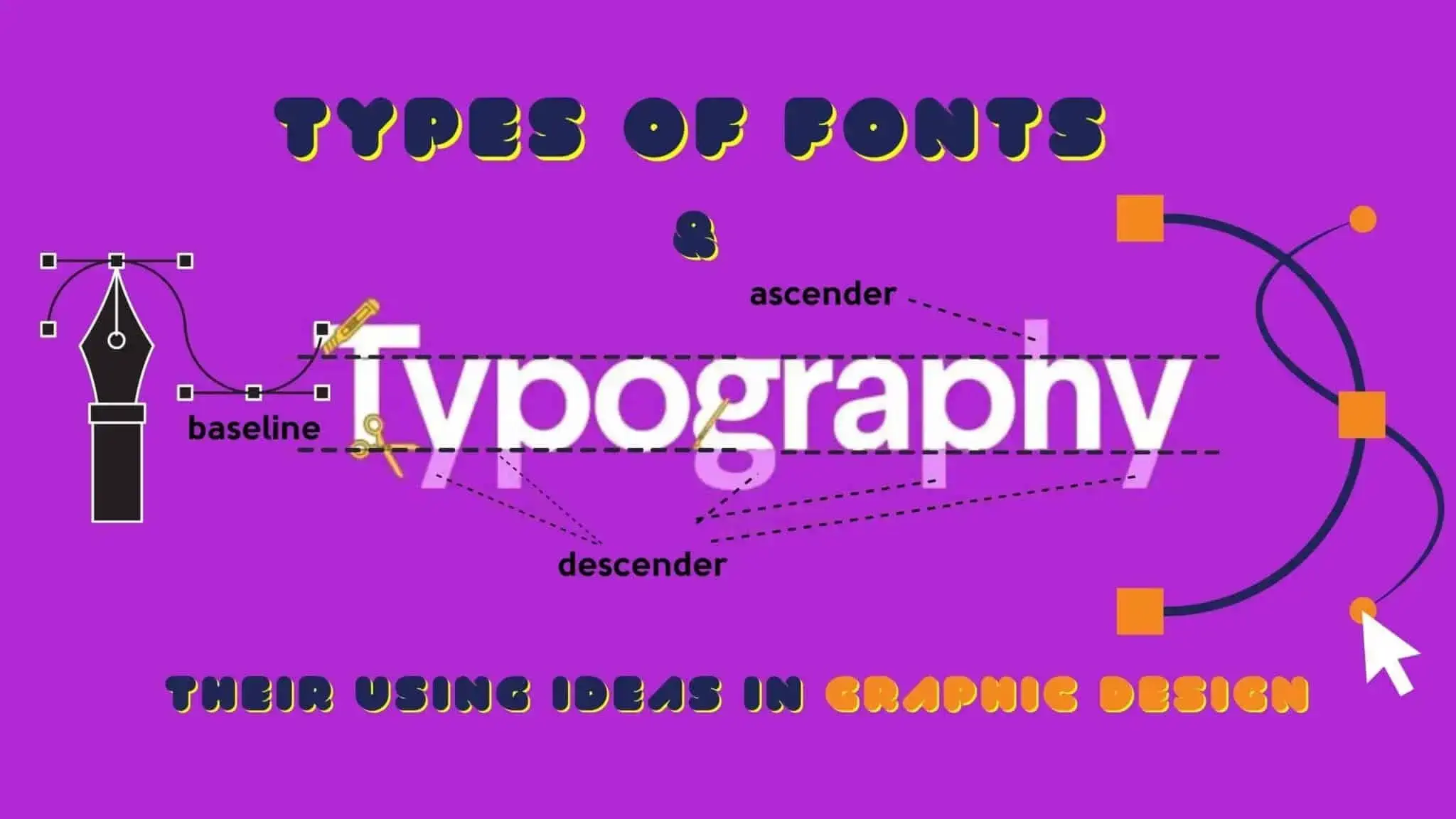
Typography can be tricky to get right. A suitable typeface can mean everything. If the designer picks the wrong typeface, the message they are trying to convey could be unprofessional or hard to understand. Professionally designed fonts can add personality to any artwork, mainly when they include a unique, symbolic, or stylized character or set of characters.
Even when working with professional graphic designs, sometimes the client wants something a little more unique. In this case, it is a good idea to work with a hand-drawn, artisan typeface. So it’s vital to choose suitable types of fonts.
To choose the right font for your projects, you need to know the types of fonts.
In this guide, we will evaluate several of the most noticeable font types and clarify how you can use them in your styles.
Let’s get into it.
Types Of Fonts
- Serif Fonts.
- Slab-Serif Fonts.
- Sans-Serif Fonts.
- Monospace Fonts.
- Script Fonts.
- Handwritten Fonts.
- Decorative Or Display Fonts.
Serif Fonts
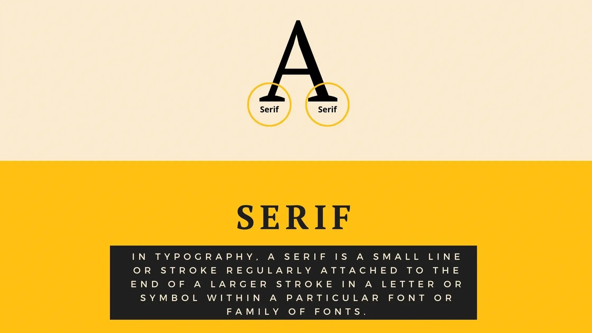
In graphic design, the choice between a serif and a sans-serif font is often debated. The reason is simple enough – Serif fonts tend to look more modern than sans-serif fonts. They are also more suited to decorative lettering and decorative text. Serif is usually a bold, thin line or stroke followed by a more significant stroke or line in a smaller font or typeface. The main reason why Serif typefaces have their enthusiasts is primarily because of their readability, especially for those who read at a slow or medium pace. They are easy to read and maintain.
Finally, Serif Font has become a prevalent typeface family, probably because it’s desirable and clear, and there are so many different fonts to choose from. Many people prefer a very bold or monochrome appearance, whereas others prefer to keep things clean and tidy. If you find it challenging to make the final decision, or if you have already made up your mind and still don’t know which Serif Font to use, then you could always consult a type designer. They would suggest what type of Serif Font you should use and what size, style and color would suit your body text best.
Some Popular Serif Fonts:
- Times New Roman.
- Georgia
- St. Marie.
- Garamond
- Tiempos Text.
Brands That Uses Serif Fonts:
- Tiffany.
- Gucci.
- Burberry.
- The New York Times.
- Rolex.
- Zara.
- Abercrombie.
- Fitch.
Usage:
This type of font is perfect for lengthy text, such as books, newspapers. You can also use this font in your brand logo. So the use of serif fonts in graphic design is widespread.
Slab-Serif Fonts
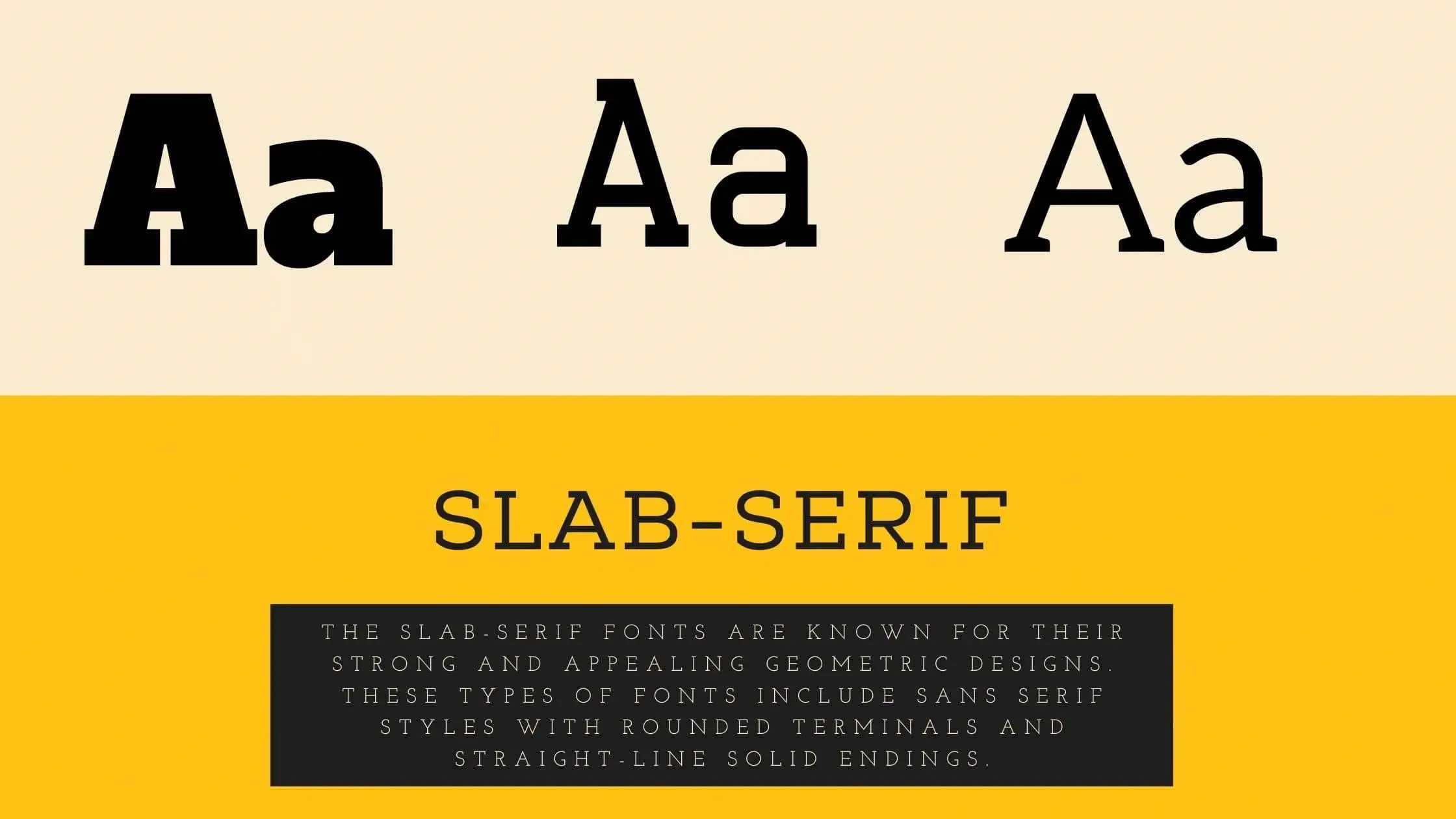
Slab-Serif fonts first appeared in the late 1800s. They quickly became popular as decorative art tools and were used extensively in early woodblock and illustrative advertising. Today, if your company is looking for something with a touch of quirkiness to its business identity, a Slab-Serif may be exactly what you need. A slab-serif typeface can add a refreshingly original touch to your marketing materials.
The slab-serif fonts are known for their strong and appealing geometric designs. These fonts include sans serif styles with rounded terminals and straight-line solid endings. Many slab serif fonts have decorative elements such as stylized decoration and script lettering. You will require a larger than usual size to achieve a bolder visual effect to achieve more aggressive designs.
A slab serif face based on a geometric model has a contemporary and vintage feel. The modern style is characterized by a condensed appearance with sharp angles and flat weights. This typeface is usually printed in black or gray and is suitable for casual and formal designs. You can choose a heavier-weight typeface with gold accents and brushstrokes for a more refined look.
The most widely used geometric slab-serifs in contemporary designs are the Quattro Glyph and the Garamond. These geometric slab-serifs are printed in weights ranging from ten to two hundred. They are usually available in both script and oghalic styles.
Some Popular Slab-Serif Fonts:
- Adelle.
- Clarendon.
- Archer.
- Nexa Slab.
- Amasis.
Brands That Uses Slab-Serif Fonts:
- Volvo.
- Sony.
- Honda.
Usage:
Their clean, geometrical lines and balanced weight make them suitable for all types of display text. These types of fonts are commonly used in signage and corporate identity projects.
Sans-Serif Fonts
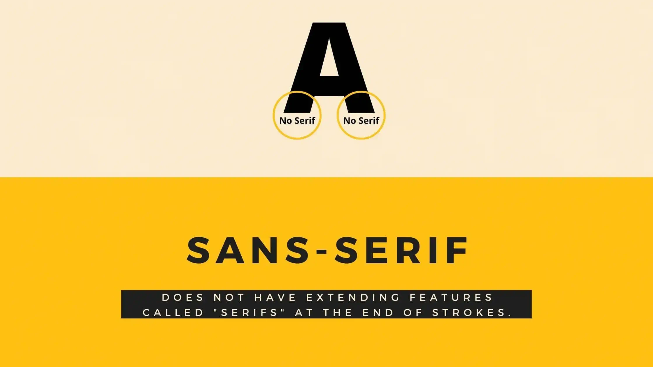
In designing and typifying text, a sans serif, sans-glyphic, Gothic or just simply sans script typeface is one that doesn’t have ornamental extending characteristics known as “serifs”. Sans-glyphic fonts tend to have much less extra stroke width variation than serially arranged fonts. This makes them suitable for use with texts which may have a straightforward calligraphy style or may feature stylized blocks of letters. They’re also very useful for use with texts which are condensed or for use with non-italic scripts where a more decorative script typeface is intended.
Related Post: 15 Best Free Sans-Serif Fonts For Designers
Another thing to keep in mind when choosing your next sans-serif font is to be aware of the balance between your chosen typeface family and your typeface itself. Many designers choose serific scripts because they’re easier to implement in larger typefaces, but their delicate properties make them seem artificial and unnatural when used in smaller text. Balance is crucial when dealing with typeset materials. You need to find the sans that convey your intended message without making the other elements of your design look out of place. It’s easy to go overboard when it comes to balancing your fonts, so take some time to focus on developing a clear design strategy for the typeface and content you plan to work with.
Some Popular Sans-Serif Fonts:
- Helvetica now
- Proxima Nova.
- Futura.
- Public Sans.
- Geonik Pro.
Brands That Uses Sans-Serif Fonts:
- Jeep.
- Panasonic.
- Target.
- Microsoft.
- Caterpillar.
- Nike.
Usage:
The tidy, crisp lines of sans serif font styles are the primary factor many internet designers choose this design of font style for on-screen usage. The clean lines and also sharp sides have the ability to make out more clearly on a display which enhances legibility for individuals. This font is also perfect for elegant logos.
Monospace Fonts
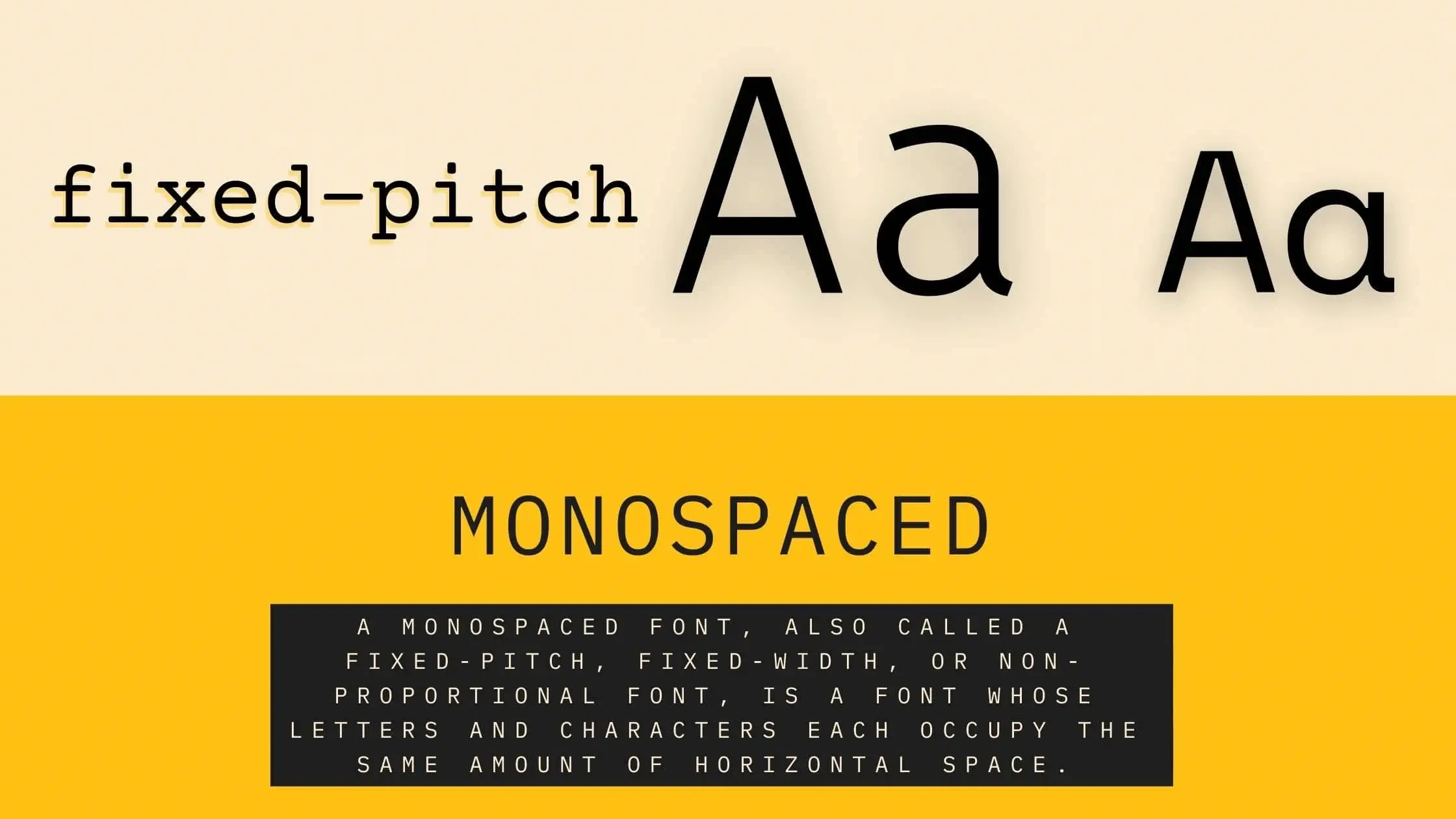
Simply put, a monospaced typeface, which is also known as a fixed-weight, flat-style, or proportional font, is a typeface that uses similar size and shape throughout its range of available letters. This contrasts with variable-sized fonts, in which the sizes and shapes of the letters vary. The Japanese commonly apply mono-space typefaces to create simple and primary documents such as letterheads, business cards, and stationery. A variation of the mono style can be found in Times New Roman and Arial, and while these typefaces can produce stunning results, their limited size and shape limit their use to a singular purpose.
Some Popular Monospace Fonts:
- Courier,
- Apercu Mono,
- GT Pressura Mono,
- Inconsolata,
- Maison Mono.
Brands That Uses Monospace Fonts:
- Vega Scene.
- Hüngry Beast.
- Kimski.
- Shuang Shuang.
Usage:
Mono-space typefaces are widely used in computer software such as Word and Outlook because of their simplicity and clarity. However, some designers argue against the monotony of these fonts and prefer to use other typeface families that have more variation within their typeface styles. These types of fonts are also used for coding.
Script Fonts
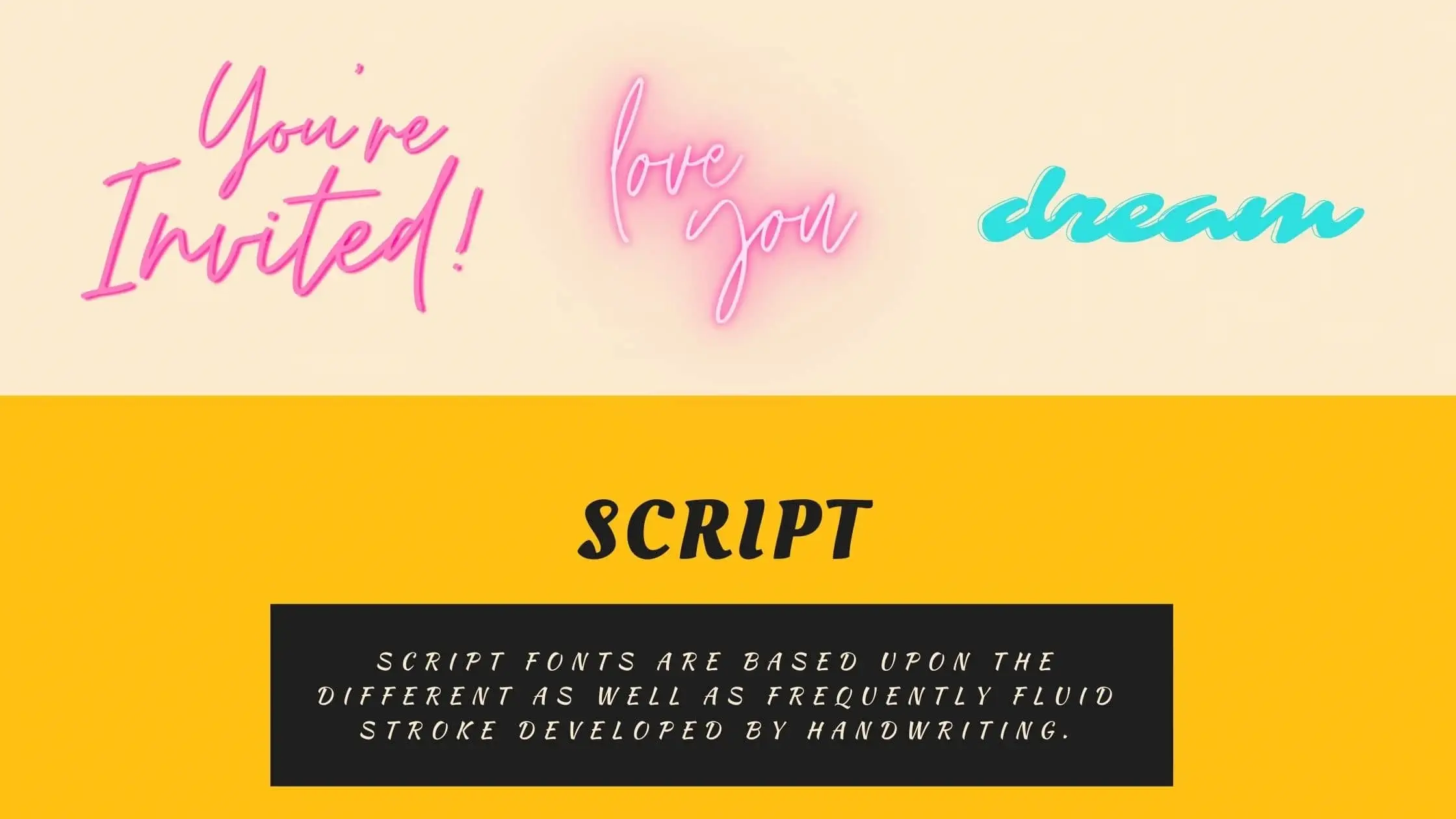
Script typefaces can be handwritten or computer-generated. Many script fonts are based on the various and often fluid pen strokes made by handmade handwriting.
They are usually employed for print or display design and not for long body copy in the classical Latin alphabets. Some old Greek alphabet typeset fonts, particularly in scripts and faces, were an approximate simulation of handwritten handwriting. The advantages of scripts and specifically the kerning of scripts over traditional typesetting systems is that there are no ligatures or helical breaks, which require careful re-keying.
One of the things that distinguish a Script Font from other types of Font is the choice of upper and lower case letters. This gives the appearance that the text is printed in a single style and that the character is printed with little utilization, making the Font look more “organic”. Scripts that are written with uppercase and lowercase letters can appear to be more formal and therefore lend themselves better to printed collateral. Lowercase and uppercase letters sometimes appear to be slanted or vertically aligned in script font faces.
There are many places online where you can download free script fonts. Some of the places where these fonts can be found include the Allura Script font bank, and also the Typecast fonts. Although there are many free script fonts available, you need to be careful when choosing your script font designs because some of the free fonts may contain scripts which are not legible.
A prime example of a Script font would be the Calligraphic style. This script font is derived from a set of scripts, called the Calligraphic Letters, which were used in Japanese text writing. Each individual script was based on one stroke, which was then used to create distinct letter forms. If you look at a modern Japanese text written in the Calligraphic Style, you will see that each word has its own individual stroke, which gives each word its individual and distinctive sound.
Some Popular Script Fonts:
- Alex Brush.
- Pacifico.
- Great Vibes.
- Lobster.
- Kaushan Script.
Brands That Uses Script Fonts:
- Coca-Cola.
- Disney.
- Davidoff, Buick.
- Budweiser, Hallmark.
- Harrods, & Campbell’s.
Usage:
These types of fonts are more common on legal documents, business signage, and advertisements. Script font styles are also commonly used in web pages. This is a popular typeface for many types of printed material, including booklets, brochures, maps, signs, and decorative paper. This typeface is also found in various advertisements, posters, and promotional materials, as well as many logos. A lot of old prints come with a script background, as the popularity of this typeface spread mainly among newspapers.
Handwritten Fonts
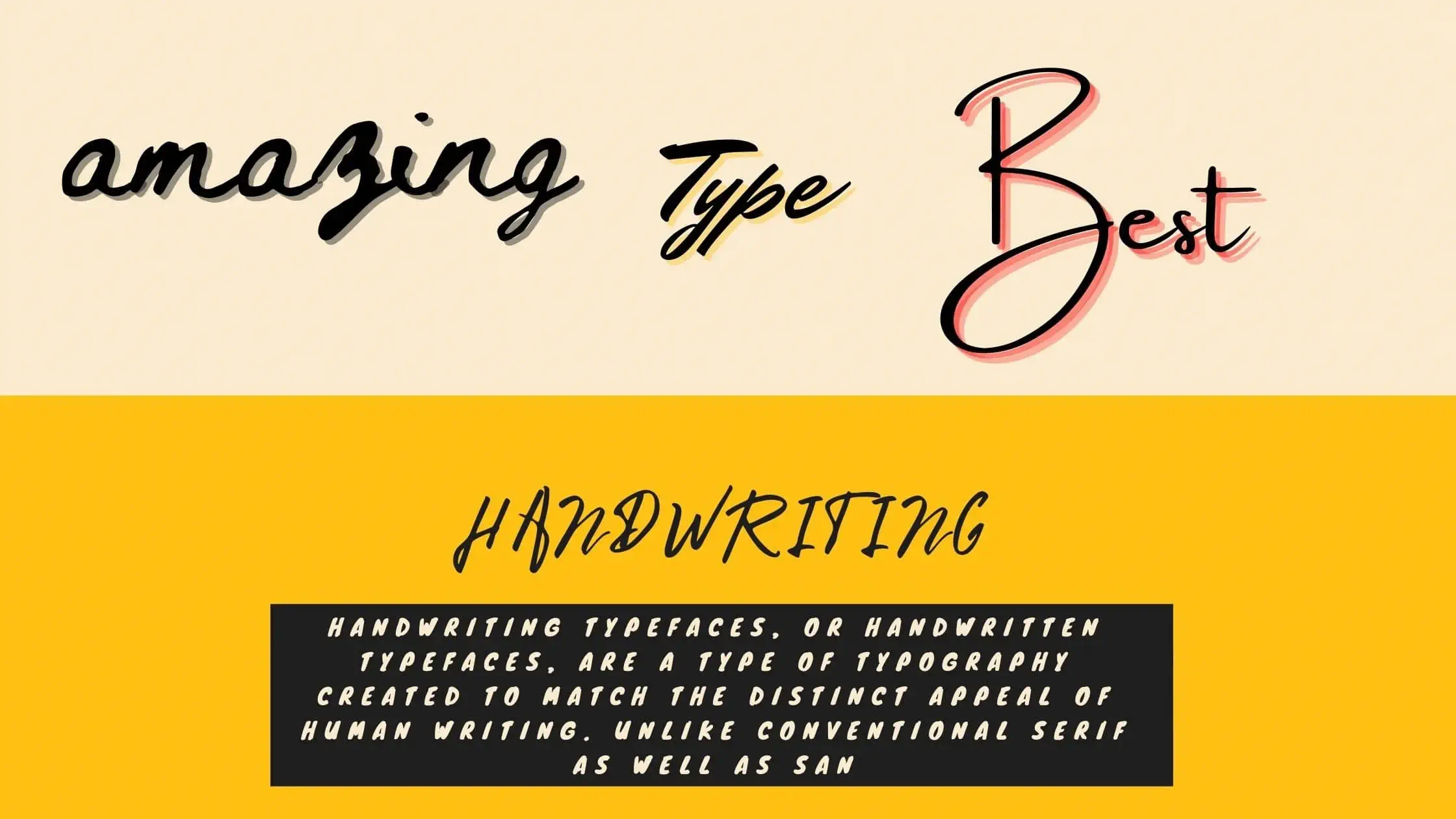
The handwritten font is a typeface that is typically printed on letter-sized paper. The term “handwritten” refers to the fact that the text was handwritten before it was printed. The majority of people in business have purchased printed materials and advertisements that have been handwritten, and thus, there is quite a large market for this type of merchandise. Handwriting fonts are similar to cursive fonts but with fewer constraints. A handwritten font is different from a computer-generated typeface. Handwritten fonts are often hand-signed by the artist or designer.
Handwritten fonts are usually considered high quality because they are made by a professional who pays attention to the details of the handwritten characters. The cost of these products will vary depending on the type of font chosen. Handwritten fonts can be printed in full color or in sepia tone. There is also a wide price range for printed handwritten fonts. They can be as expensive as the expensive, professionally printed paperbacks or even less expensive than the cheap, thrift store copies of fiction novels.
Some Popular Handwritten Fonts:
- Autography.
- Dancing Script.
- Wild Youth.
- Permanent Marker.
- Pacifico.
Brands That Uses Handwritten Fonts:
- Instagram.
- Virgin.
- Barbie.
Usage:
These types of fonts are very popular with people who like to customize and design decorative lettering. They can be used for titles, stationery, invitations, business cards, thank you notes, manuals, brochures and more. Handwritten Fonts are often purchased by those that want to add their personal style and flair to promotional materials. In recent times, there is a resurgence of interest in vintage and antique hand lettering products.
Decorative Or Display Fonts
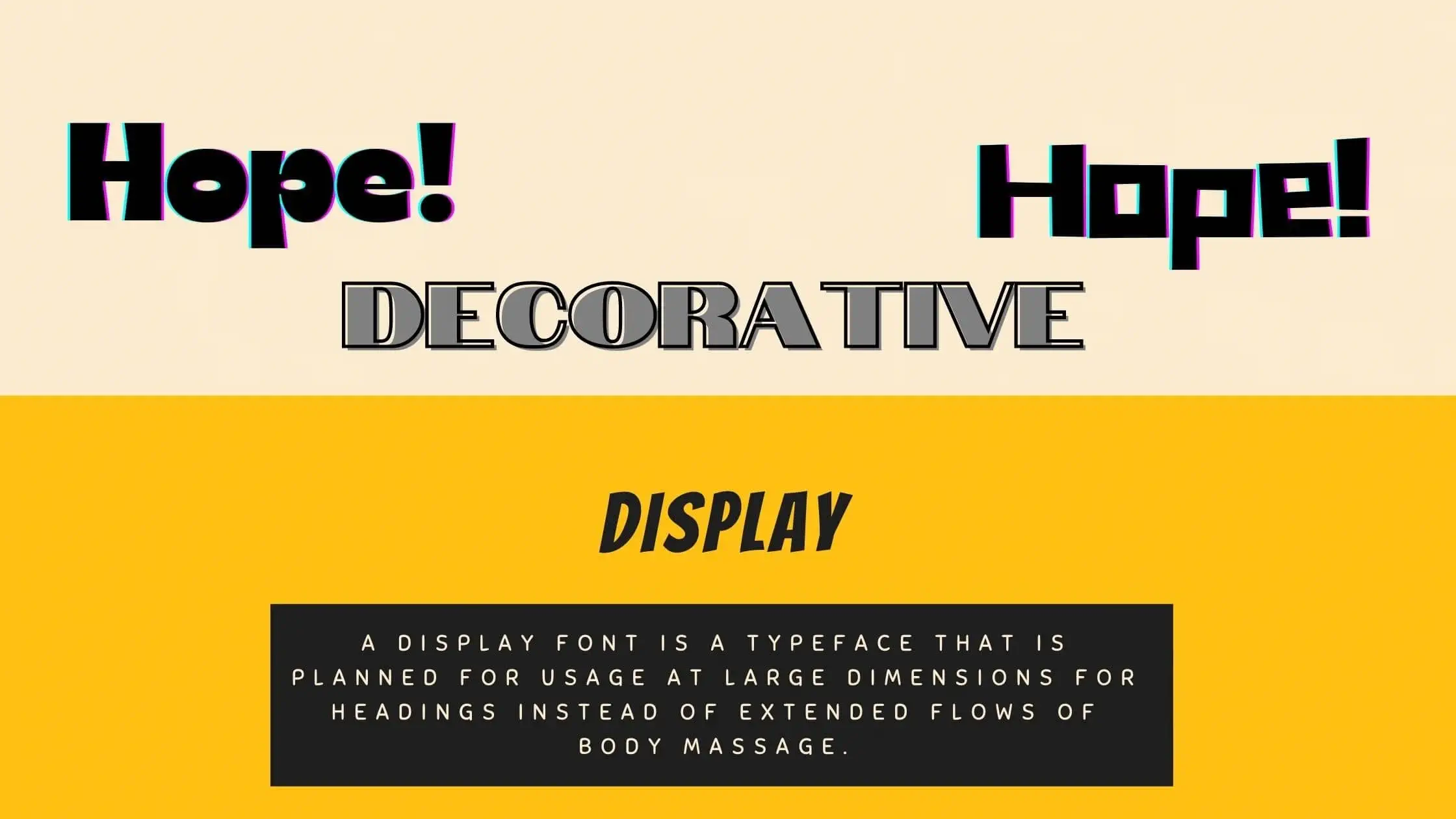
A display font is a typeface that is planned for usage at large dimensions for headings instead of extended flows of body massage.
Display or Decorative typefaces will frequently have more eccentric and variable designs than the other types of fonts, pretty restrained fonts typically used for body text. They might take inspiration from various other genres of lettering, such as hand painted indications, calligraphy, or a visual appropriate to their usage, possibly ornamented, unique, abstracted, or pulled in the design of various writing systems.
Numerous font styles are specifically related to display setups, such as slab serif, manuscript font style, reverse-contrast, and a lesser level sans serif. Walter Tracy specifies screen typefaces in the metal kind feeling as “sizes of kind over 14 factors” and in a layout that “message kinds when bigger can be used for headings show types, if decreased, can not be utilized for text setting.
Some Popular Display Fonts:
- Bombing.
- Gigi.
- Jokerman.
- LOT.
- Rumble Brave.
Brands That Uses Display Fonts:
- Toys R’ Us.
- Lego.
- Fanta.
Usage:
Decorative or display type fonts can be suitable for nearly any business logo design because you can quickly convey whatever individuality is right for you. By tweaking, twisting, as well as fine-tuning your fonts, you can show your organization as being informal, straight, enjoyable, or special.
Last Words
In conclusion, there are many types of fonts, each with its own distinct purpose. Knowing which type of font to use for what situation can be a daunting task, but with the help of a professional typographer or type designer, it can be done easily and with great results. So whether you’re creating a document for business or personal use, keep in mind the different types of fonts available and use the right one for the job at hand.

