Vote For Pedro Font Download
Few Words About the Vote For Pedro Font
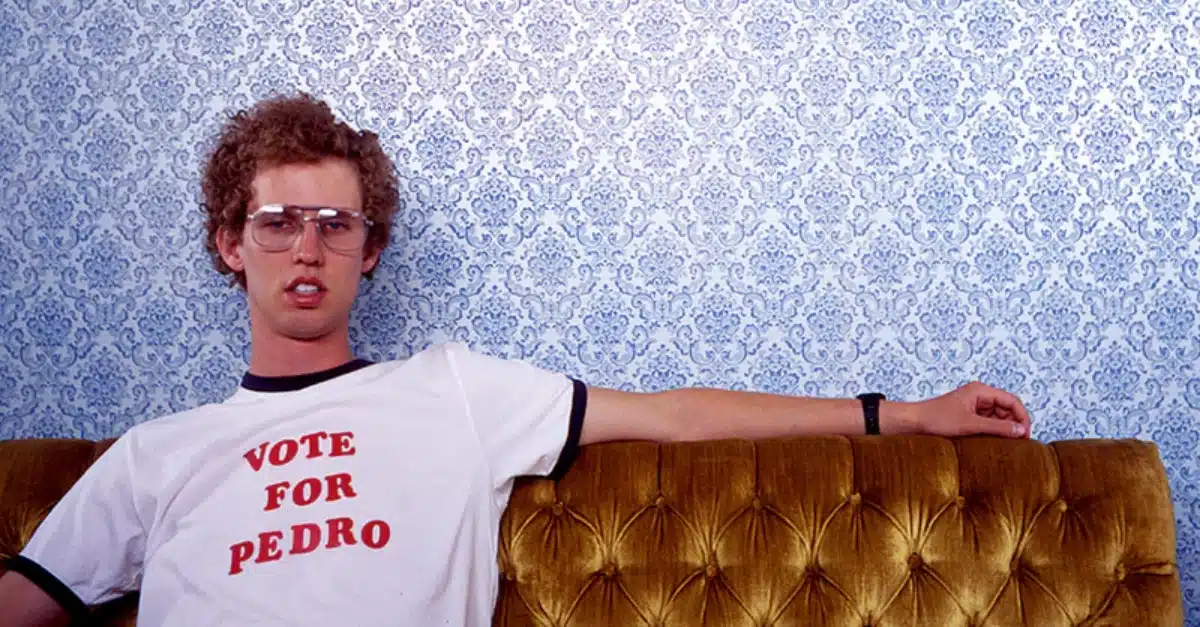
I have always loved bold and retro typefaces, so the Vote For Pedro font immediately brought back warm memories. The famous “Vote for Pedro” shirt from the movie Napoleon Dynamite is one of those designs that stays with you.
Every time I look at its lettering, I remember why this font style became so iconic. The soft curves, heavy weight, and friendly serif structure create a nostalgic feeling that is perfect for anyone searching for the Vote for Pedro font free or the Vote for Pedro font free download.
Like many designers, I discovered that the original movie lettering was not a separate typeface. It was inspired by Cooper Black, one of the most recognizable serif typefaces of the last century. This font appears in advertising, magazines, packaging, and many commercial projects.
Cooper Black was designed in 1922 by Oswald Bruce Cooper and released through the Barnhart Brothers type foundry. Its rounded serifs, curved edges, and warm letterforms make it feel alive. The font blends a 1920s personality with touches of groovy 1950s and 1960s design. This gives it a strong vintage and retro charm that designers like me appreciate.
Today, the phrase “Vote for Pedro” is still one of the most well-known uses of this style. Many graphic designers continue to search for the font used in the movie shirt. Even though the original design was custom, Cooper Black remains the closest and most trusted match. If you enjoy retro typography or want to generate the same aesthetic, this typeface is a great place to start.
Features of the Vote For Pedro Font
The real features people associate with the Vote For Pedro font come from Cooper Black. Here are the qualities that shape its look and feel.
1. Strong and Heavy Weight
Cooper Black is famous for its bold and chunky appearance. This makes it perfect for shirts, posters, advertisements, and logos. It commands attention while staying friendly.
2. Rounded Serifs
The soft and round endings give the typeface an inviting character. These rounded serifs also help with readability, even at medium distances. It was often recommended for printers with near-sighted customers because the shapes were so easy to see.
3. Smooth Curves and Soft Edges
The font avoids sharp corners and instead uses gentle curves. This creates a warm and approachable style. It improves legibility and makes the letters feel balanced.
4. A Retro and Vintage Personality
The font was created between 1919 and 1922. It reflects early 20th century design trends but also feels comfortable in 1970s and comic-inspired artwork. This wide aesthetic range makes it a great choice for vintage projects.
5. Popular and Culturally Recognized
Cooper Black has appeared in magazines, posters, packaging, and now in one of the most memorable pop culture shirts. This strong cultural history adds to its appeal.
6. Great for Vector and Custom Artwork
Designers can easily adjust its letterforms. You can convert it into vector graphics, use it in generators, or modify it for custom use. Many free fonts online also echo its look and allow beginners to experiment.
Where Can You Use the Vote For Pedro Font?
This typeface works well in many creative areas. These are the uses where I have found it most effective.
1. T-Shirts and Print Apparel
The original movie shirt is the perfect example. The typeface has a hand-made feeling that works wonderfully on clothing.
2. Logos and Branding
If you want a warm and friendly logo, this font brings instant character. It works for food brands, vintage shops, children’s products, and playful packaging.
3. Posters and Advertising
The bold weight makes it excellent for posters and advertisements. It is ideal for short headlines that need to stand out.
4. Editorial and Magazine Titles
Use it for titles or special spreads. It adds personality to magazines and print features.
5. Web Graphics and Social Media
It performs well at larger display sizes in online banners and promotional images.
6. Retro and Vintage Projects
If you want a groovy or nostalgic feeling, this typeface fits naturally. It pairs nicely with simple serif fonts like Times New Roman for body text.
Cooper Black Font License
The original Vote For Pedro lettering is custom. Cooper Black, the closest match, is a commercial font. It is not free for commercial use. You need to buy a license from an authorized type foundry or reseller. Some free fonts try to imitate the style, but always check the license before downloading or using them for a project.
What is the easiest way to install this font on my device?
There’s no reason to be worried. Please follow our directions.
You may also find out more about typography and how it is classified from here.
Please do not hesitate to contact me if you have any questions. Thank you very much!


Leave a Reply