About Call of Duty Font
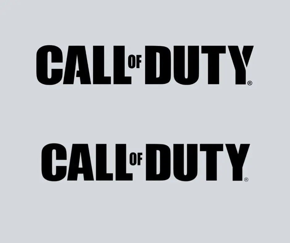
Call of Duty by Activision is a first-person shooter video game in 2003. In 2021 this game got so much popularity. As a result of this popularity, the logo and font used in the Call of Duty game series are of great interest to designers. There are two main Call of Duty logos we are very familiar with: the official logo that appears on its website and the one that appears on the posters for many of the series’ games.
The official Call of Duty logo, which you can find on their website, is made with a decorative sans serif typeface, while the other is the non-decorative sans serif of the same typeface.
What font does Call of Duty use?

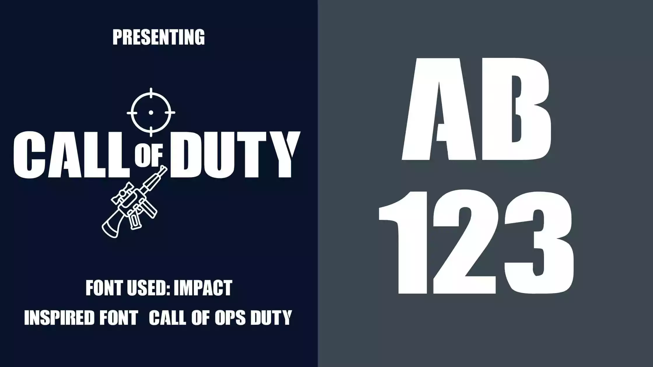
Both the Call of Duty logo is designed with Impact font. The 1st logo has some customization of Impact font, and the 2nd one has no customization.
But, If you want a font similar to the customized logo, you can use the Call of Ops Duty font. You can download both the Impact and the Call of Ops Duty font from here. Now let’s take a look at the details of the two fonts.
About Impact Font
The impact font family was Geoffrey Lee’s project in 1965. It is a family of sans-serif fonts made by Sheffield’s Stephenson Blake foundry. Impact is a very well-known typeface because it has been included in Microsoft Windows since Windows 98 as part of the core fonts for the Web package. Its thick strokes, close letter spacing, and simple inner counter form are all meant to “make an impact,” as its name suggests. You can download the free version of this font only for personal purposes, so be careful about this.
About Call of Ops Duty Font
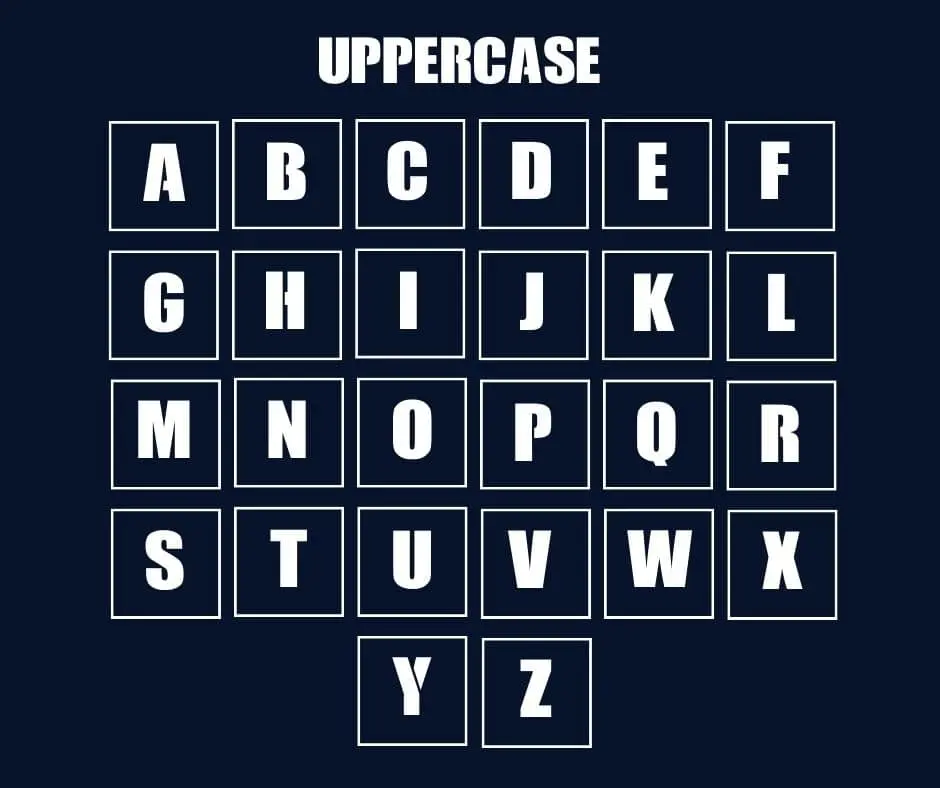
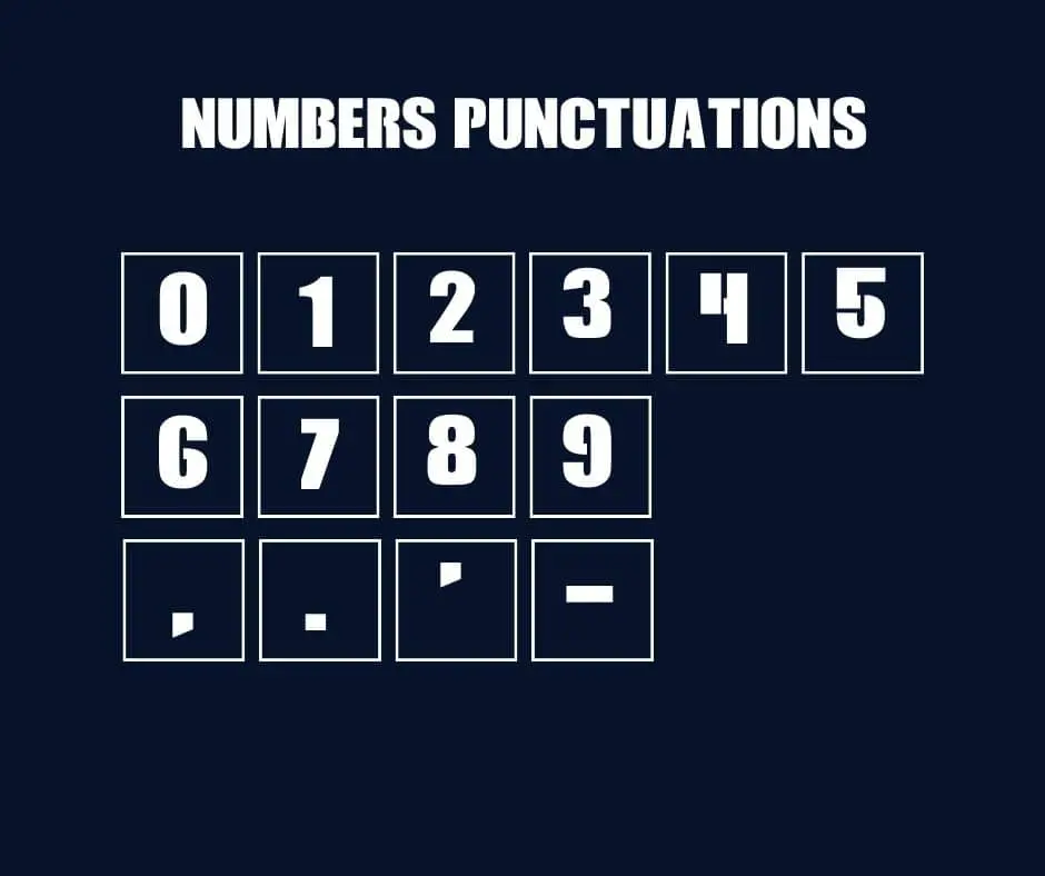
Call of Ops Duty is a decorative sans serif font designed and shared by Chequered Ink. Allison James and Daniel Johnston are the designers behind Chequered Ink. Impact font and Call of Ops Duty font share some similarities, but there is a gap in some letters (A, B, G, H, P, R, and Y) of Call of Ops Duty font. There are two versions released by Chequered Ink for this font. You can download the free version of this font from here for personal purposes only. All uppercase and lowercase letters and a few special characters are included in the free version.
Character Map


Why Should you use Call of Duty font?
Call of Duty font is a great way to give any document more style and personality. It can also help to make your text more readable. Basically, Sans Serif fonts like these two are particularly good for this because they have a clean, modern look. They’re also good for headings and other large blocks of text because they don’t take up as much space as regular fonts. So If you’re looking for a typeface that will add a touch of class to your documents, decorative Call of Duty is the perfect option.
Font Information
| Font Name: | Call of Duty. |
| Font Used: | Impact. |
| Similar Font: | Call of Ops Duty. |
| Style: | Decorative, Sans-Serif, Logo Font. |
| Designer: | Geoffrey Lee, Chequered Ink. |
| License: | Free Font. |
| Version: | Latest. |
FAQ
Ans: No, It is not free for commercial purposes. You can use the free version only for personal purposes.
Ans: Cod uses two types of lettering style: the official is the decorative style of Impact font and the 2nd is the non decorative style of Impact.
Ans: Whether you have an Android device, an iOS device, or a PC, this font works on them all.
Ans: There are no risks associated with the use of these two fonts. The download and use of them are both easy.
What is the easiest way to install this font on to my device?
There’s no reason to be worried. Please follow our directions.
You may also find out more about typography and how it is classified from here.
Please do not hesitate to contact me if you have any questions. Thank you very much!


