

The Finals Font Download
Few Words About the The Finals Font
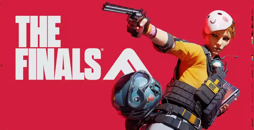
When I first came across The Finals Font in the game’s logo, I was immediately drawn to its bold and intense personality. It has that strong visual presence that instantly communicates action, energy and modern gameplay. As someone who spends a lot of time studying letters and shapes, I found myself appreciating how clean, sharp and confident the design feels.
The Finals is a free-to-play first-person shooter created by Embark Studios and published by Nexon. The logo uses Dharma Gothic, a typeface that fits the game’s fast, team-based environment perfectly. Its condensed structure and powerful lines give the game a distinctive look that stands out in both digital and printed visuals.
Features of The Finals Logo Font
The official typeface used in The Finals logo and poster is Dharma Gothic. It was designed by Ryoichi Tsunekawa and released through his foundry, Dharma Type. What makes this font so impressive is its versatility and carefully crafted design.
Here is the key features explained clearly:
1. Typeface Category
Dharma Gothic is a condensed sans-serif typeface with a modern, humanist touch. This makes it suitable for bold visuals while maintaining clarity.
2. Strong Design Language
Its sharp edges, clean cuts and tall forms create a futuristic style. Every letter feels intentional, giving the font a powerful and structured look.
3. Great Balance and Spacing
Characters are tightly spaced but still readable. This helps the font deliver impact in headlines, posters and logos without feeling overcrowded.
4. Wide Range of Weights
The family includes 42 styles, from thin and elegant to extremely bold. This allows designers to build complete visual systems with a consistent tone.
5. Extensive Character Set
It supports Latin-based languages and includes alternates, symbols and numerals. This makes it suitable for branding projects with multilingual needs.
6. OpenType Features
Ligatures, stylistic alternates, fractions and proportional numerals give designers full control over details in professional layouts.
7. Family Consistency
All styles follow the same visual rhythm, making them easy to mix within a project. Whether you are creating a bold logo or light UI text, the overall look remains unified.
Where Can You Use the The Finals Font?
Dharma Gothic is made for bold, high-impact design. It works especially well in projects that need strong personality and modern style. I’ve used it in game-related visual design, branding concepts and large-scale posters, and it performs best when you want the typography to stand out.
Best places to use this font include:
- Game titles and in-game graphics: Perfect for action, e-sports or first-person shooter environments.
- Logos and brand design: The condensed style makes logos look sharp and memorable.
- Posters and advertising: Ideal for creating intense, eye-catching layouts in limited space.
- Editorial and magazine covers: Use bold weights for headlines that feel stylish and modern.
- Web and UI design: Works well for clean and futuristic interfaces when used in larger text sizes.
- Packaging and apparel branding: Great for tech-inspired or street-style products.
Pairing Tip: Combine Dharma Gothic with a simple sans-serif like Saira for body text. This creates a clean contrast and keeps the design readable while maintaining a bold visual identity.
Font License
Although the font used in The Finals logo is widely recognized, Dharma Gothic is not free for commercial use. You must buy a proper license from Dharma Type if you want to use it in professional or commercial projects.
- Designer: Ryoichi Tsunekawa
- Foundry: Dharma Type
- License: Paid
- Commercial Use: Requires purchase
- Official Source: Dharma Type website
Trials or previews may be available on the official page for those who want to explore the typeface before buying.
What is the easiest way to install this font on my device?
There’s no reason to be worried. Please follow our directions.
You may also find out more about typography and how it is classified from here.
Please do not hesitate to contact me if you have any questions. Thank you very much!


Leave a Reply