About Impact Font
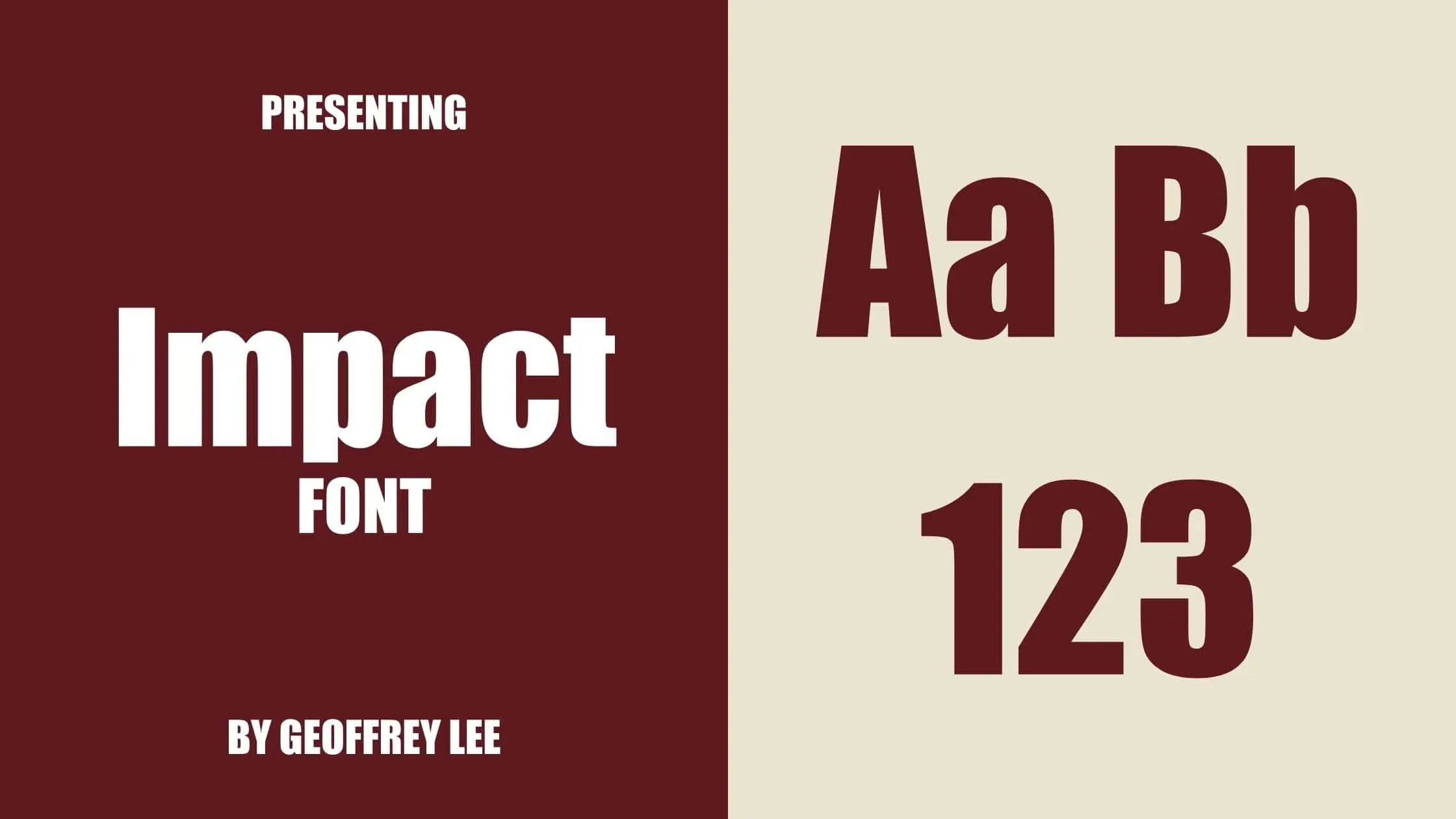
Geoffrey Lee designed the impact font family as a project in 1965. It is a sans-serif font family released by the Stephenson Blake foundry of Sheffield. Impact is a very well-known typeface because it is part of the core fonts for the Web package, which has been part of Microsoft Windows since Windows 98. It’s a grotesque typeface with a blocky, industrial look. Impact tends to get a lot of attention because it is so bold. Maybe this is why the Internet took off the way it did in the 2010s. It may also have something to do with how easy it is to get. Many people can use this font because it is a system font. This font was used a lot in image macros and other Internet memes by 2014.
Impact font has been updated many times since its design. When Monotype acquired the design license, they updated this, and now it supports up to 14 OpenType features. Impact also supports up to 82 different languages.
In 2002 Lee digitized and self-released Impact Wide so that it could be sold online. This release has alternate characters and a style that uses italics.
Also, In July 2010, Ascender Corp released an updated version of Impact and named Impact 2010. They added quirky interlocking characters and additional OpenType type features. Terrance Weinzierl and Steve Matteson worked together to design this font.
Design And Features
Geoffrey Lee wanted to make an easy-to-read letter that didn’t take up too much horizontal space. Because of this, the design ended up with thick lines and tall characters that stood out.
Its thick strokes, tight letter spacing, and minimal inner counter form are all meant to “make an impact,” as its name suggests. Impact has a high x-height that goes almost all the way to the capital line. Ascenders are short, and descenders are even shorter. Lowercase letters can be hard to read when printed small, especially for people with poor eyesight, because the spaces between the letters are small and the letters are folded up.
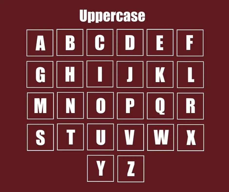
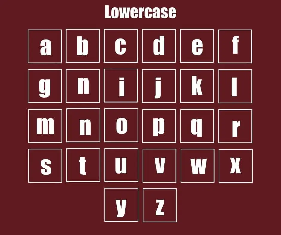
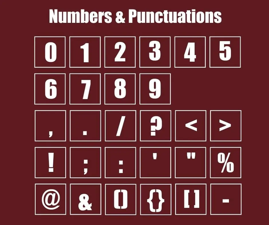
Character Map


Why Should you use Impact font?
One reason why this font might be used is that it is popular. Also, Impact’s bold sans serif type style, especially with thicker strokes, is often a great choice for highlighting information, like headlines or titles. You will definitely be encouraged to use this font if you look at the fields where it has been used. This font was featured on the cover of Slam magazine in 1997 and on the packaging for a Brazilian dairy product named Paulista dairy. We will also see the use of this font on the cover of a popular book called Design in Question.
So hopefully, you can understand that Impact is a versatile and affordable typeface that you can use for a variety of purposes. Whether you are creating a poster or want to design a headline for your blog post, Impact font will make the task much easier. Not to mention, Impact font is free to use, so there is no reason not to give it a try!
Font Information
| Font Name: | Impact. |
| Style: | Sans-serif. |
| Designer: | Geoffrey Lee. |
| License: | Free Font. |
| Version: | Latest. |
Download Impact Font From Here
Font License
Free for personal use only. For buy the commercial version click the button below.
Impact Supports The Following Languages
Tok Pisin, Tumbuka, Afar, Afrikaans, Aymara, Breton, Bosnian, Asturian, Catalan, Corsican, Czech, Welsh, Bemba, Bikol, Danish, German, Cebuano, Greek, English, Esperanto, Spanish, Estonian, Basque, Finnish, Fijian, Faroese, French, Irish, Galician, Hungarian, Indonesian, Icelandic, Italian, Friulian, Cornish, Hiligaynon, Latin, Luxembourgish, Ganda, Lithuanian.
Typefaces Similar To Impact
These fonts are similar to Impact:
- Bebas Neue.
- Anton.
- Oswald.
- Morton.
- Devant Pro.
- Averta Standard.
- Mortadella.
- Compacta.
- Moon Impact Font.
- Devant Horgen.
Font Combination
Since it is a very long font i.e. tall x-height, this font is perfect for titles or headings and with it you can use the following fonts as body text.
- Baskerville.
- Roboto.
- News Gothic.
FAQ
Ans: There is a free version of this font which is only available for personal purposes.
Ans: Impact is so popular due to its interesting design. Its thick strokes, tight letter spacing, and minimal inner counter form make this font so much popular.
Ans: Yes, It is a good font. Whether you are creating a poster or want to design a headline for your blog post, Impact font will make the task much easier.
Ans: Impact is a sans-serif font family released by the Stephenson Blake foundry of Sheffield and designed by Geoffrey Lee.
Ans: Yes, both PC and MAC users can download it without any worries.
Ans: If you want the free version of Impact then click the download button or to buy the premium version by clicking the “Buy From Here” button for full features.
What is the easiest way to install this font on to my device?
There’s no reason to be worried. Please follow our directions.
You may also find out more about typography and how it is classified from here.
Please do not hesitate to contact me if you have any questions. Thank you very much!


