
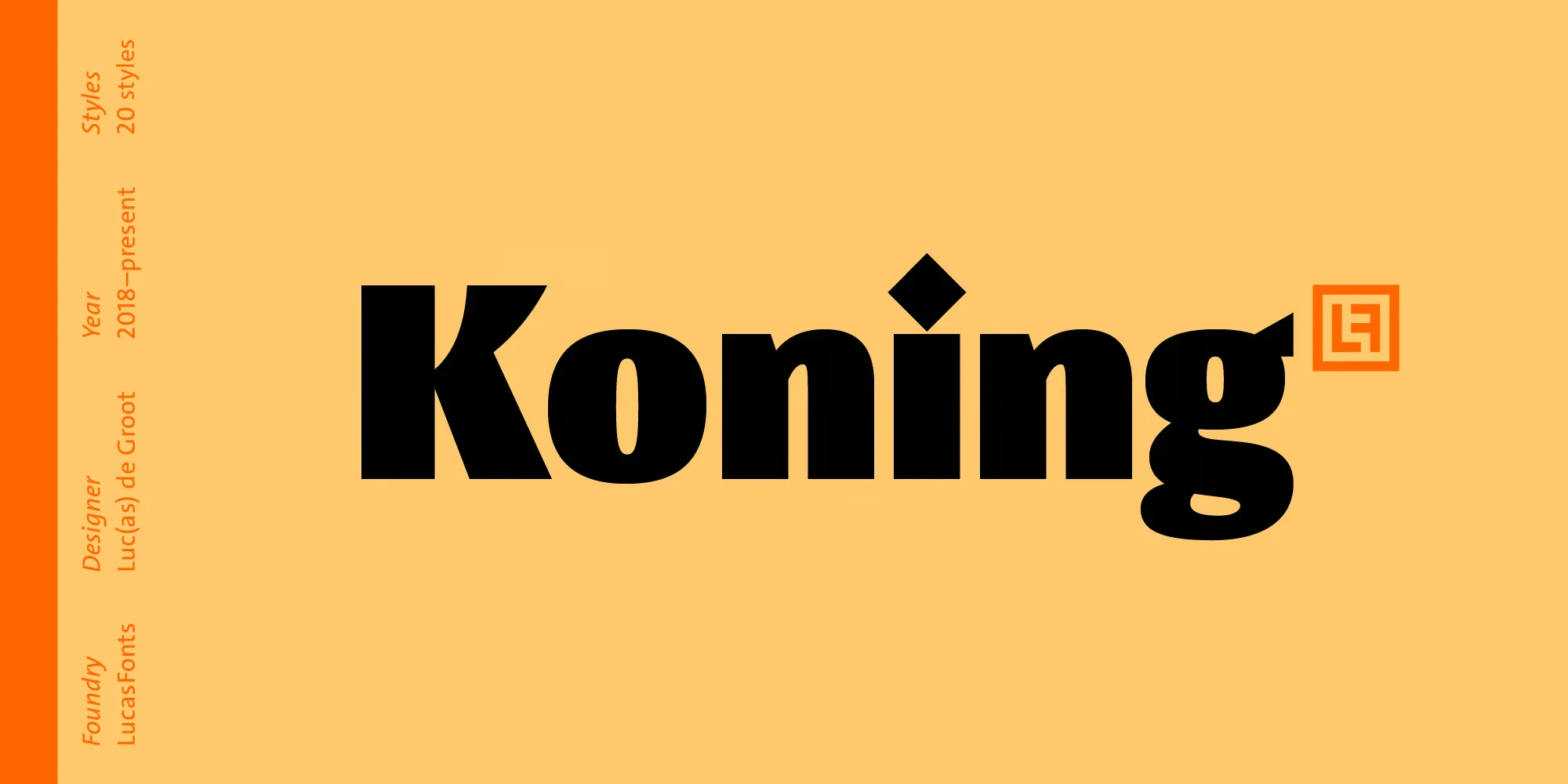

Looking for a versatile and legible sans serif to elevate your designs? Allow me to introduce Koning Sans Serif, a contemporary high-contrast sans-serif font family that delivers style and clarity across print, digital, and environmental applications.
Koning Display Font Family was designed by Luc(as) de Groot and published by LucasFonts. LucasFonts invites you to download the free demo and experience the versatility of this contemporary sans-serif font family.
Once you’ve witnessed Koning Sans Serif’s potential first-hand, upgrade to the full family for unlimited access. The premium license provides all weights, optical sizes, languages, and glyph alternates you need to deploy this neo-grotesque with creative confidence.
Koning Display Font Download
What I Like About Koning Display Font
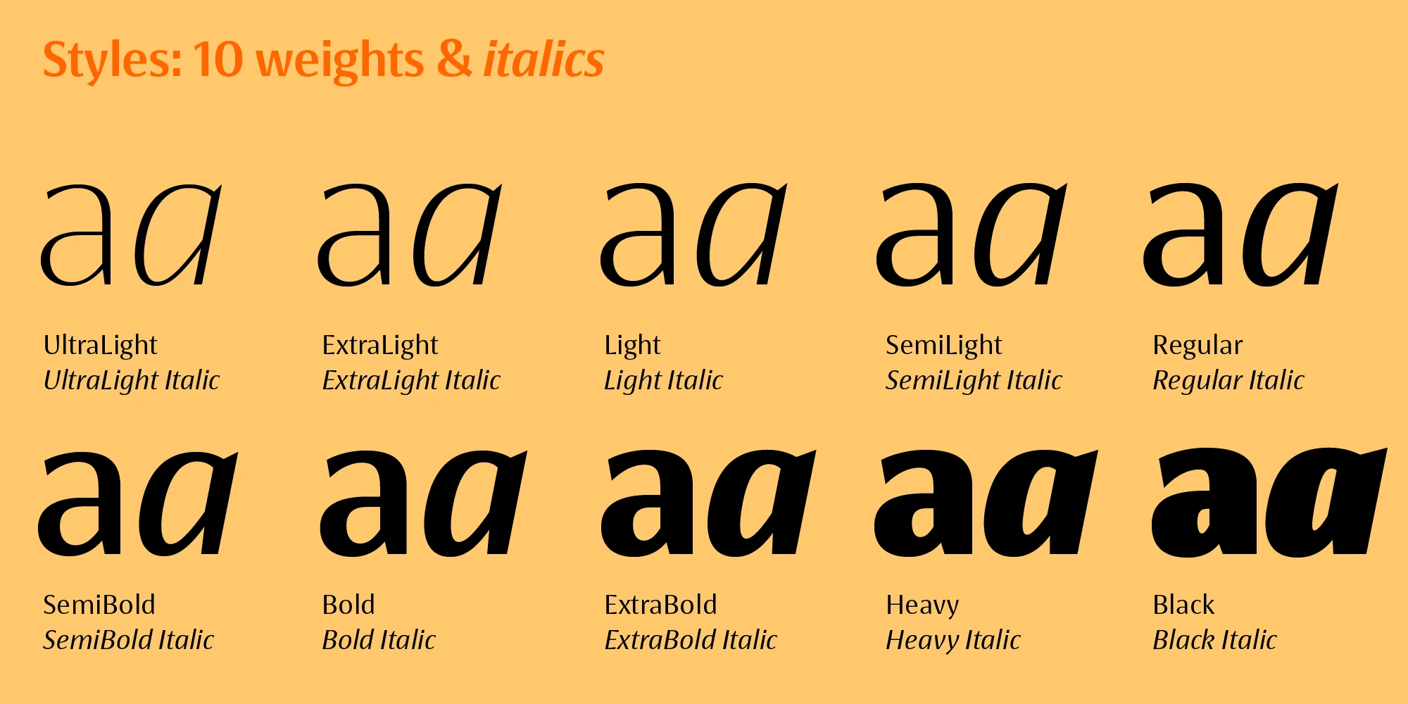
In Koning Sans, I’ve found a new favorite. After taking this high-contrast neo-grotesque for a test drive, I’m impressed by its stylistic range and legibility.
The letters have thick and thin parts that make them look almost like stencils but still have a nice handmade quality.
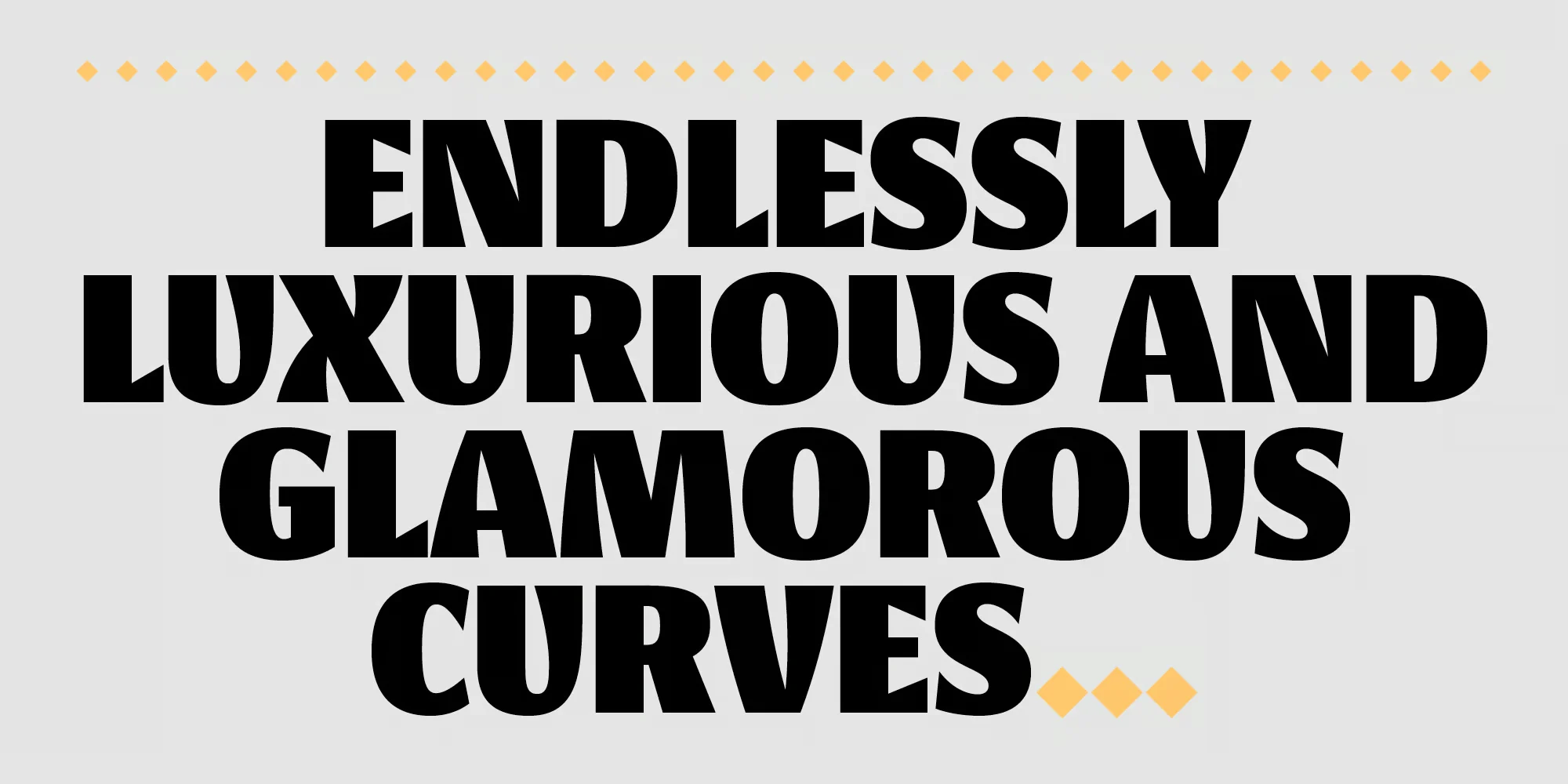
When used small for paragraphs, Koning Sans Serif is still easy to read. The space inside the letters stays open, and the ascenders and descenders (the parts that stick up and down) are long enough. This helps keep words distinct when reading. The size of the lowercase letters is tall, giving the body text more impact.
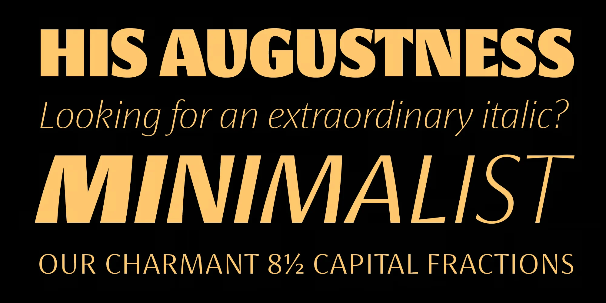
I like that Koning Sans Serif has alternate letter forms to mix things up. Multiple weights allow me to make clear levels of importance from light to extra-bold text. With sizes made for print, web, and big uses like signs, Koning Sans Serif works well across all my projects.
The best thing is its flexibility. Whether I use it softly or loudly, Koning Sans Serif always enhances my design. It’s a modern font I can trust for both branding and editorial work. I’m excited to use it more!
Where You Can Use Koning Font Family?
Here are some ideas for using Koning Sans Serif Font :
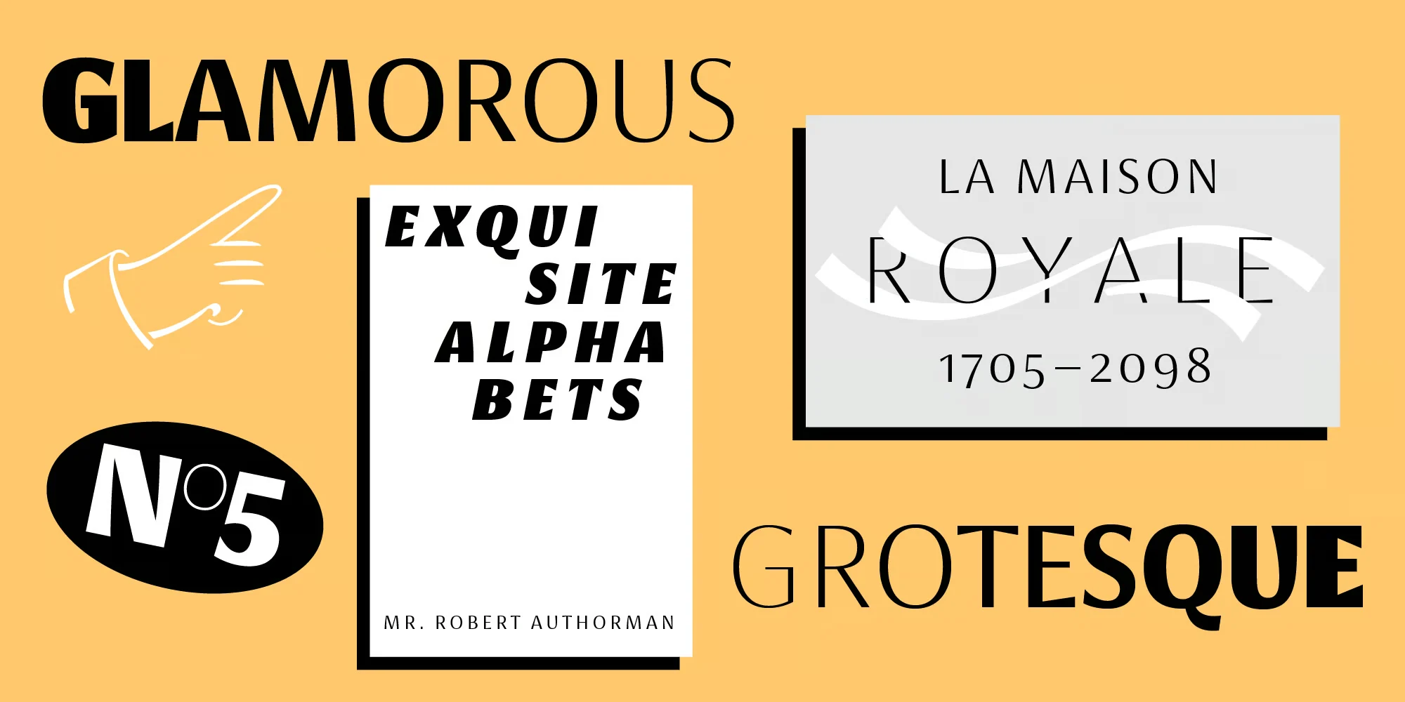
- Headlines: This font pops for headlines and titles. Its thick and thin lines grab attention. Use it big and bold for cover lines, ads, posters, etc.
- Logos: The clean lines of Koning Sans Serif make it ideal for logos. It looks modern and simple, perfect for tech or fashion brands.
- Website text: On websites, Koning Sans Serif is easy to read in smaller sizes. Use it for paragraphs, menus, and headings. The many weights help organize information.
- Packaging: On product packaging, Koning Sans Serif displays a stylish personality. Pair it with colorful visuals and photography.
- Signs & prints: This font works great! Print it huge on signs, banners, t-shirts, and large format projects. The angular letters even echo stencil art.
- Editorial design: For magazines, books, and publishing, Koning Sans Serif brings a refined style. Flowing text stays crisp and clear.
If you want to learn more about the usage of display fonts like this, click here.
Font License
This font is free for PERSONAL USE.
What is the easiest way to install this font on my device?
There’s no reason to be worried. Please follow our directions.
You may also find out more about typography and how it is classified from here.
Please do not hesitate to contact me if you have any questions. Thank you very much!


Leave a Reply