
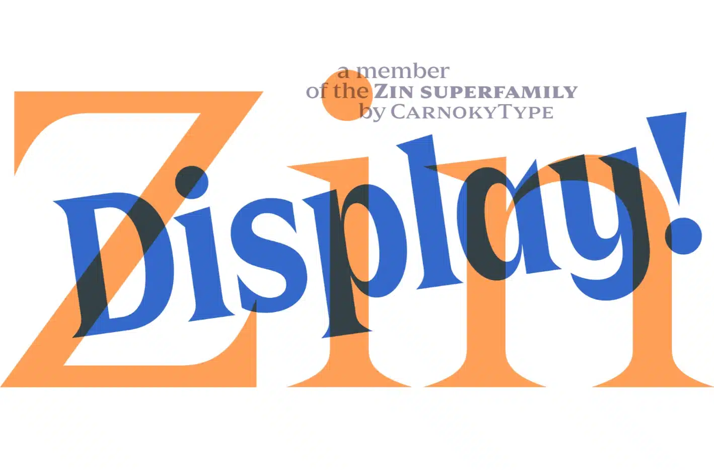

I just discovered an awesome new display font that totally fits the bill – Zin Display!
I was making a flyer for my bud’s band gig and wanted something that would grab people’s attention. Well, this font straight-up delivers.
What I especially love about Zin Display is its versatility – the various weights, like Extra Bold, allow me to make it as low-key or loud as I want.
If you’re a fellow designer looking to give your projects a contemporary edge, I recommend adding Zin Display to your font collection.
Designers: Samuel Čarnoký
Publisher: CarnokyType
Zin Display Font Download

Features Of Zin Display Font
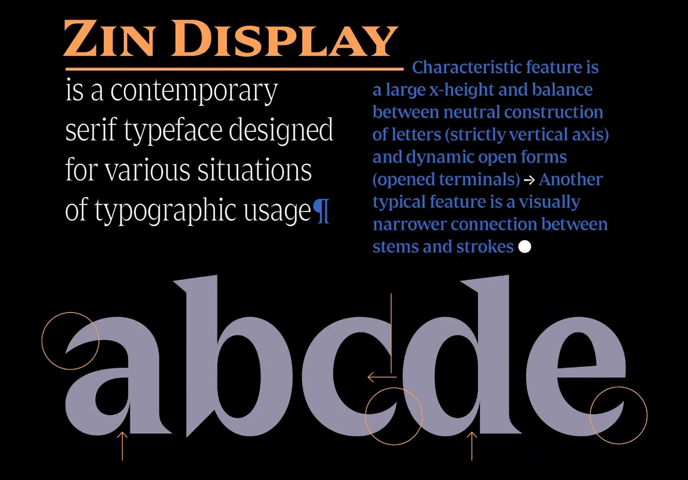
The first thing I noticed was those capital letters with their nearly perfect vertical lines – tall and imposing but not overly strict or stuffy. They have just enough curves and flare to add some personality.
The rounded terminals (those little open ends) inject a bit of softness while allowing letters to connect in a way that flows nicely when strung together.
Another great feature is the large x-height, meaning the size of the main body of lowercase letters compared to the capitals. A roomy x-height like this improves readability, especially at smaller sizes. No squinting to decode this font!
Some other little details that give Zin its dynamism are those pointy wedge serifs and the sharp instrokes (the interior lines of letters like “e” and “s”). These create crisp edges and angles that dial up the display factor.
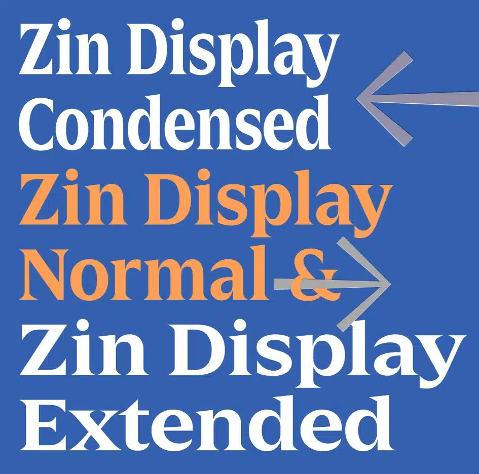
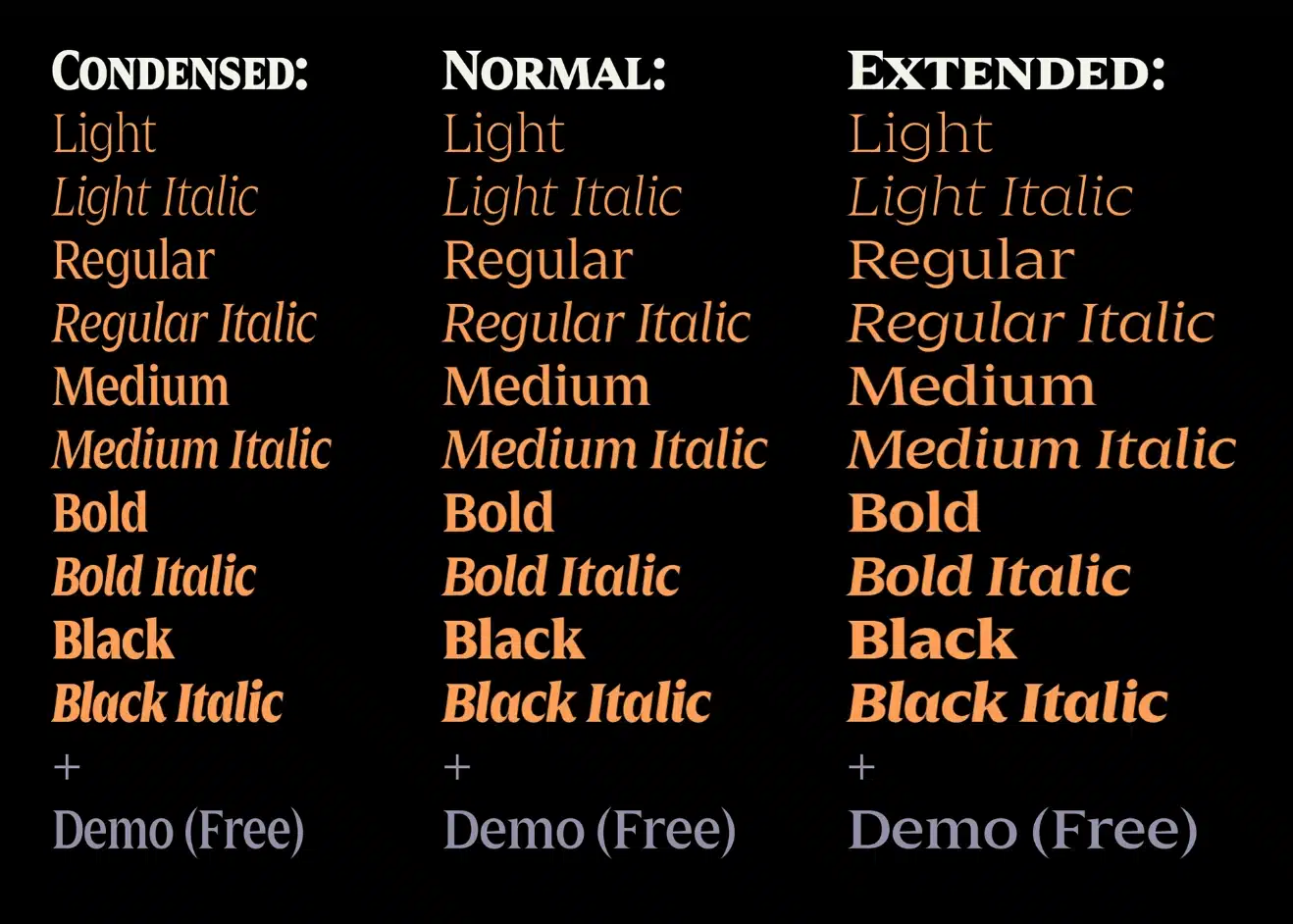
With 3 widths, 5 weights, and matched italics, this typeface family offers a ton of versatility, too. Light and airy or bold and dramatic – skinny or wide – upright or slanted – Zin can pull it off!
So if you’re looking to add some visual excitement and modern flair to display text, headers, posters, etc., I’d definitely put Zin on your shortlist to try out! Its legibility, flexibility, and subtle edge make it a knockout.
Where Can You Use the Zin Display Serif Font?
I especially love Zin for magazine and editorial layouts. Those capital letters are so imposing and dramatic that they instantly grab your attention on a magazine cover or feature headline.
The range of weights and widths provides flexibility to experiment with eye-catching large text or balance it with clean and airy body copy.
Another sweet use case for Zin is orientation and wayfinding systems. Those clear, prominent letterforms are perfect for information hierarchy when you want key navigational elements or locations to pop out. Condensed Zin kills it on spaces where you need bold text but have a limited area to work with.
Honestly, anytime you want to dial up some instant visual dynamics to capture interest, impress with sophistication, or convey a modern high-tech aesthetic, Zin Display has you covered. Corporate branding, packaging, promotions, you name it – Zin brings customizable display appeal.
So, download the Zin Display Font Now!
If you want to learn more about the usage of display fonts like this, click here.
Font License
This font is free for PERSONAL USE.
What is the easiest way to install this font on my device?
There’s no reason to be worried. Please follow our directions.
You may also find out more about typography and how it is classified from here.
Please do not hesitate to contact me if you have any questions. Thank you very much!


Leave a Reply