


YouTube Sans Font
YouTube uses the font Trade Gothic Bold Condensed for its logo. However, YouTube Sans is a custom typeface designed specifically for the platform. It’s used for branding and content.
So, Trade Gothic is used for the YouTube logo, while YouTube Sans is used for branding and content.
Youtube Font Generator
Characteristics of YouTube Sans font
The Design Philosophy
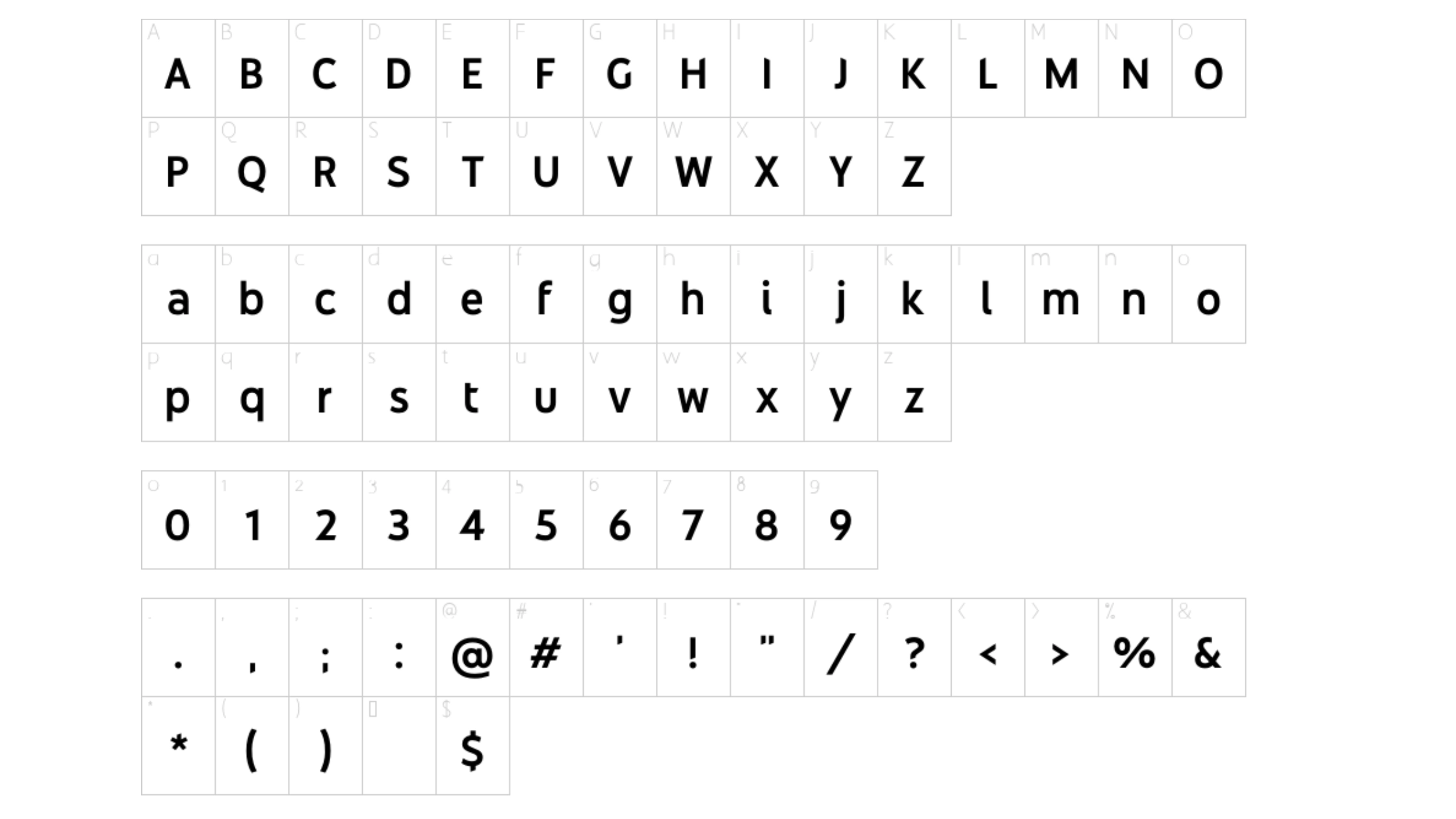
YouTube Sans is a modern, geometric sans serif font. It’s crafted for readability and consistency on diverse digital platforms. The designers aimed for a contemporary yet approachable typeface, echoing YouTube’s inclusive nature. With its clean lines and simplicity, it’s a top pick for digital screens, ensuring clear communication is the priority.
Versatility and Universality
YouTube Sans stands out for its remarkable adaptability. Be it on a smartphone, tablet, desktop, or smart TV, this font retains its clarity and form effortlessly. This universal appeal is crucial for platforms like YouTube, serving a broad audience on various devices and screen sizes.
Accessibility and User Experience
In the design of YouTube Sans, particular attention was given to accessibility. The font is optimized for readability, ensuring that users can engage with content on the platform without unnecessary strain. With buttons, menus, and text fields all utilizing the same typeface, the user experience is both cohesive and intuitive.
Learn More About YouTube Sans Font:
Alternatives to YouTube Font
Although YouTube Sans serves as the primary digital voice of the platform, it is not the sole typeface utilized in its interface. Designers have the flexibility to integrate alternative fonts to introduce variety or highlight specific content when needed.
Roboto and Sans Serif Family
Apart from the bold and regular weights of YouTube Sans, Roboto, Google’s signature font appears as the secondary font choice in some areas of YouTube. Roboto’s soft, open curves and precise geometry offer a pleasant contrast to YouTube Sans, often serving as a complementary font in less prominent text elements.
Impact on Thumbnails and Artwork
For YouTube video titles and thumbnails that want to make a striking impact, YouTube creators have often turned to fonts like Impact. With its heavy strokes and tight letter spacing, Impact is designed to be, well, impactful — perfect for catching the eye in a sea of content.
Note: Bebas Neue, Lato, and Badaboom BB are also good alternatives to the YouTube font.
What Font Does Youtube Use In The Logo?
The new YouTube logo is an iconic piece of visual branding recognized worldwide. The font used in the YouTube logo is almost as well-known as the logo itself.
Trade Gothic Font
Back in the early days of the YouTube logo, they mainly used Trade Gothic as the typeface. Trade Gothic, a modern all-caps font with a bold, industrial vibe, was quite attention-grabbing. As time passed, they made some subtle tweaks to the type of the logo, shaping it into the unique look we all recognize on YouTube today.
Final Words: My Personal Thoughts
Typography represents the blend of art and functionality. It acts as the hidden connector in the designs we see daily, even on this very page. When it comes to YouTube, picking a font conveys insights into the company’s values and priorities for user experience. In crafting your digital stories, remember that each font carries its own voice. Choose wisely to let your audience truly listen.
What is the easiest way to install this font on my device?
There’s no reason to be worried. Please follow our directions.
You may also find out more about typography and how it is classified from here.
Please do not hesitate to contact me if you have any questions. Thank you very much!


Leave a Reply