Imagine presenting your brilliant ideas to a room full of potential clients, investors, or colleagues, only to be met with blank stares and utter confusion. You’ve spent countless hours designing a powerful PowerPoint presentation, but the audience just doesn’t seem to connect with it. Then it hits you – Your amazing content is being overshadowed by a lackluster font choice! Yes, the font you use can make or break your PowerPoint presentation.
In this digital age we live in, a visually engaging presentation is just as important as the content within it. But with thousands of fonts out there, where do you even begin? That’s where we come in – by the end of this blog post, you’ll learn about the best fonts for PowerPoint to help you make every slide a guaranteed hit.
Whether you’re preparing for a board meeting, a keynote speech, or a classroom lecture, our list of top-notch fonts will level up your PowerPoint game with style and readability. Ready, set, present!
The Importance of Fonts in PowerPoint Presentations
The importance of fonts in PowerPoint presentations cannot be overstated. Choosing the right font plays a crucial role in conveying your message effectively and making a lasting impression on your audience. Poor font choices can not only distract from the content, but also make it difficult to read and comprehend.
When creating a presentation, it’s important to choose the right font. There are four main types of fonts: Serif, Sans Serif, Script, and Decorative. Make sure to choose the font that suits your presentation the best. Choosing the correct font for your slides can improve their look and ensure that your audience can easily read and comprehend your message. This way, you’ll make it easier for them to follow along and understand your presentation.
Remember, the right font can make all the difference in the success of your PowerPoint presentation. So, take the time to explore different options and ensure you select a font that complements your content, theme, and overall presentation style. This way, you’ll be one step closer to delivering an engaging and effective presentation that stands out from the rest!
Unlock the Power of Presentations: The Top Fonts for Your PowerPoint
Elevate your PowerPoint presentations by selecting the perfect font to capture and impress your audience. Get your message across clearly and effectively with the right balance between professionalism and creativity.
Explore classic, sleek options like Helvetica, which is perfect for titles, or dive into the modern, geometric look of Futura. Alternatively, you can play with contrast by using a combination of Serif and Sans Serif fonts to highlight headings, body texts, and subtitles.
Remember, an outstanding presentation can quickly turn into a memorable experience with the right font choice. So, start experimenting today, and let your PowerPoint slides shine! Let’s take a look at a bunch of fonts which can enhance the look of your PowerPoint presentation.
Roboto Font
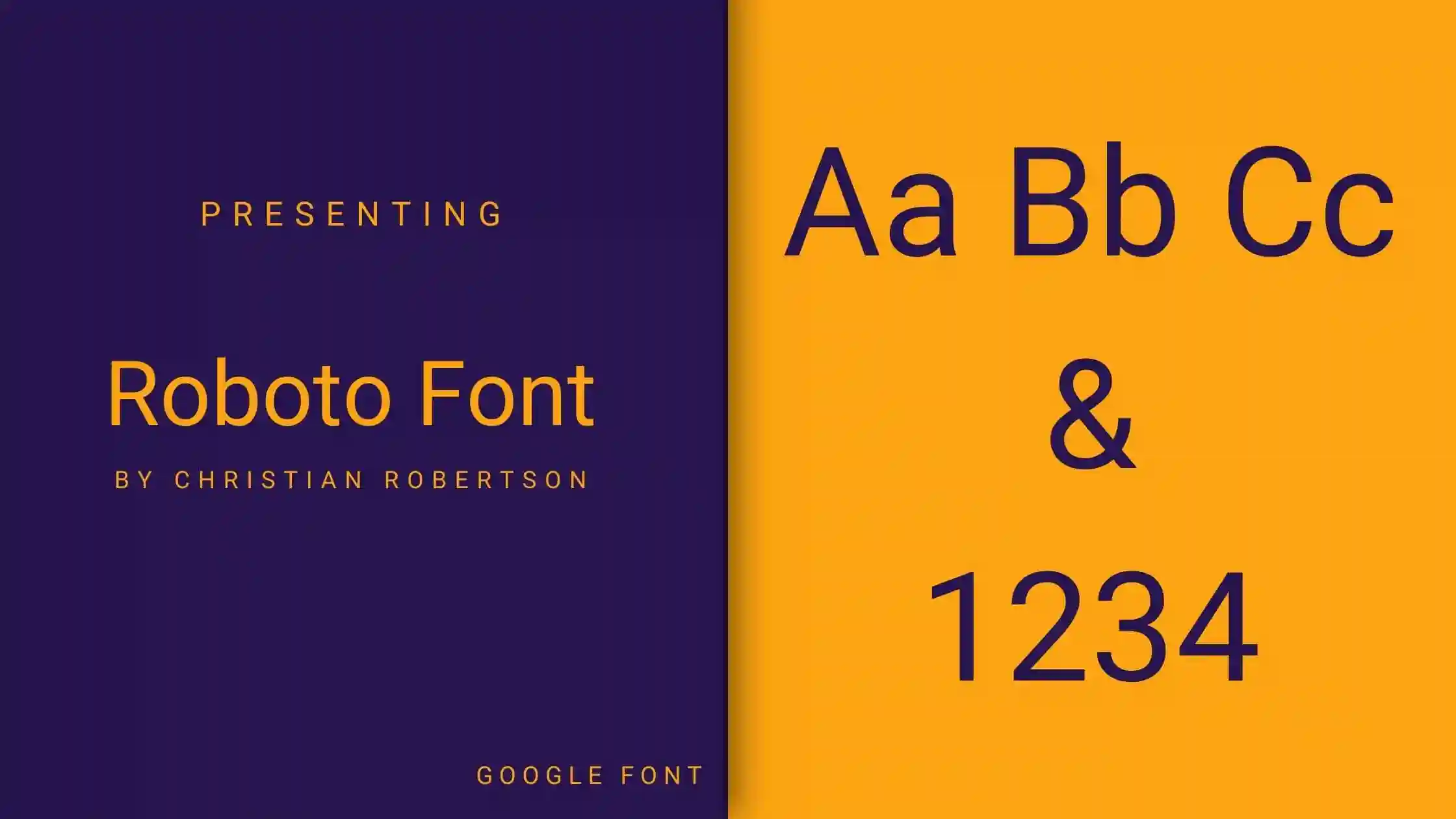
Are you looking for a modern and versatile font for your PowerPoint presentations? Look no further than the Roboto font. This sleek, sans-serif typeface is perfect for both headers and body text, making your slides both professional and easy to read.
With Roboto, your presentations will convey a sense of clarity and sophistication, no matter the industry or subject. Not only does it stand strong on its own, but it also pairs well with other fonts like Garamond for a more classic look, or even a script font like Pacifico for a creative touch.
So, why not give the Roboto font a try in your next PowerPoint presentation? You just might discover the power of a well-chosen font to elevate your slides and make a lasting impact on your audience.
Montserrat Font
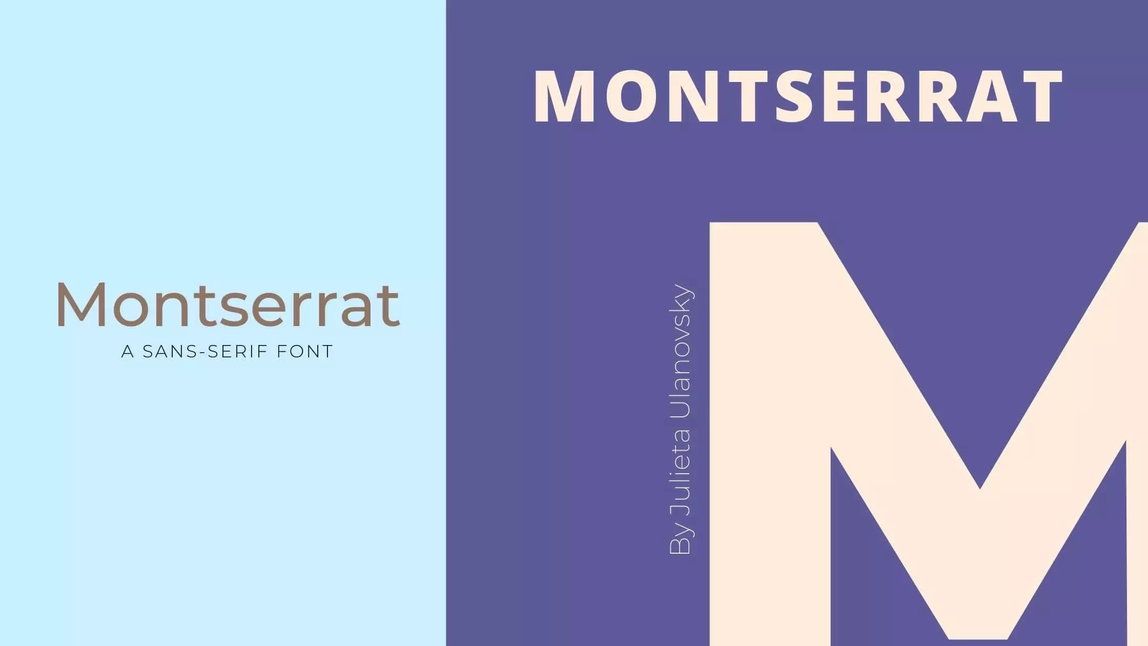
Are you looking for an eye-catching font to elevate your PowerPoint presentation? Look no further than Montserrat! This versatile and modern font is perfect for capturing your audience’s attention while also keeping them engaged.
Montserrat, a Sans Serif font, is known for its excellent readability and geometric design, which makes it ideal for any subject. It’s also available in various weights, so you can easily find the perfect style to suit your needs.
Start incorporating Montserrat into your PowerPoint presentations, and watch as your slides come to life. Your audience will appreciate the visually appealing typography while staying focused on your message. So go ahead, give Montserrat a try and bring your presentations to the next level.
Tahoma Font
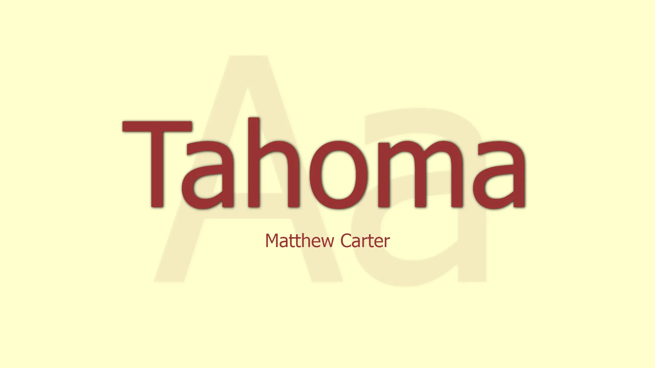
If you’re looking to create a professional PowerPoint presentation that impresses your audience, consider using the Tahoma font. This versatile font is perfect for PowerPoint slides as it offers excellent clarity and readability.
Tahoma is a no-frills, easy-to-read font that was designed specifically for on-screen use. With its well-spaced characters and clean lines, Tahoma is an ideal choice for both headers and body text in your presentation.
When you choose Tahoma for your PowerPoint slides, you’re ensuring that your audience can easily understand and focus on your message. So go ahead and give Tahoma a try – it’s a simple yet powerful way to make your presentation stand out.
Poppins Font
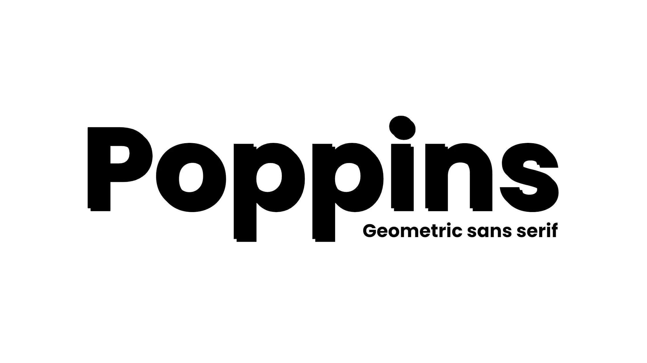
Looking for a sleek and modern font to enhance your PowerPoint slides? Poppins Font might be the perfect choice for you! This contemporary typeface can instantly upgrade your presentation, giving it a polished and professional look.
Incorporate Poppins in your headlines, titles or even body text, to make your content easily readable and visually appealing. Its geometric design sets it apart from other common fonts, making your slides truly stand out. And the best part? It pairs well with various other fonts, letting you mix and match to achieve a unique style.
Don’t settle for the standard fonts in PowerPoint – give Poppins Font a try and see the difference it can make in your next presentation!
Verdana Font
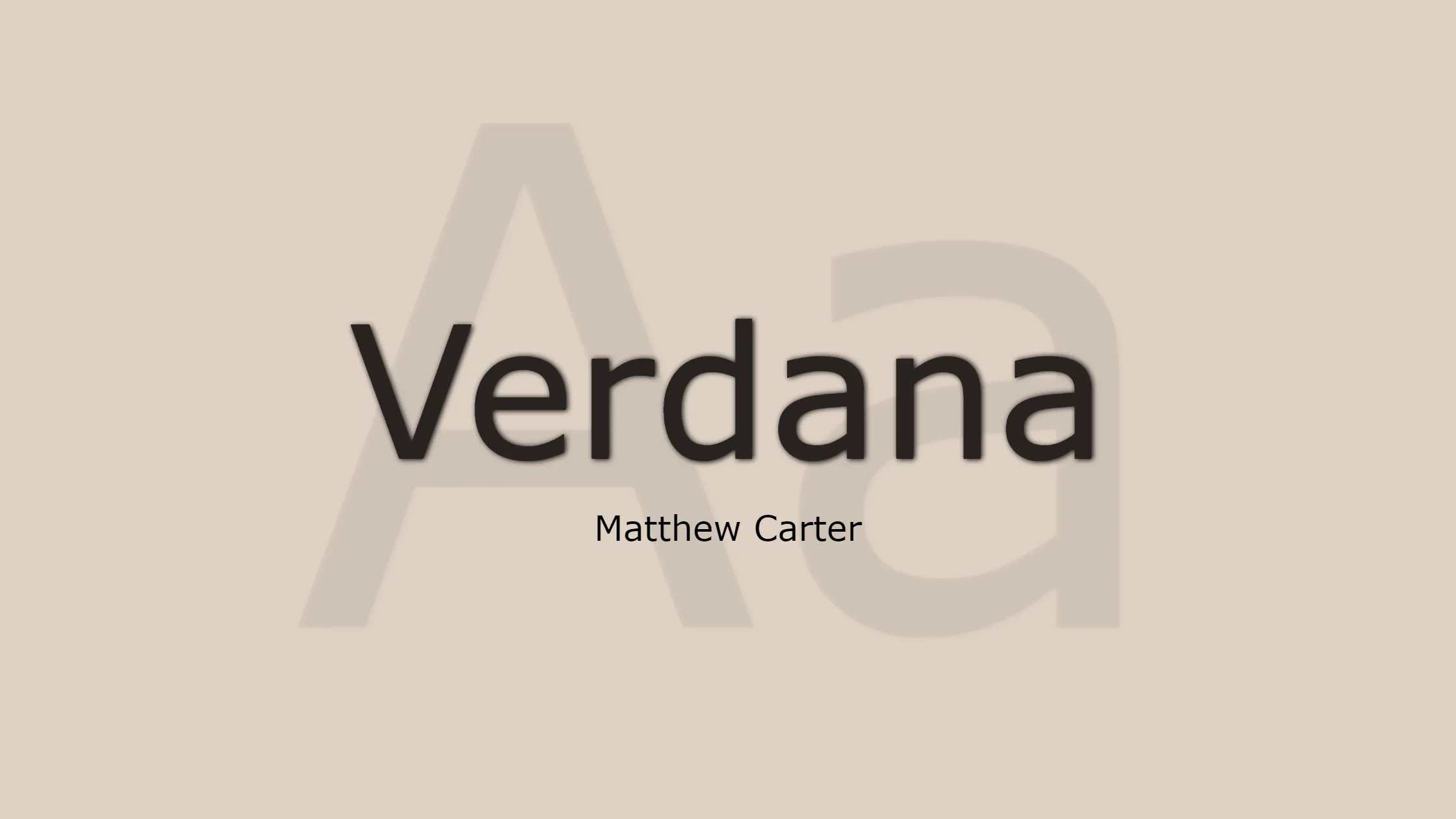
Introducing Verdana, your new best friend for creating engaging PowerPoint presentations. This font, designed specifically for digital screens, boasts excellent legibility and readability, making it a top choice for your slide decks.
Not only does Verdana look great on screen, but it also offers a friendly touch that speaks to your audience. In a sea of standard typefaces, Verdana stands out as a refreshing change.
So, the next time you create a PowerPoint presentation, choose Verdana as your font companion. Your audience will appreciate the clarity and warmth that it brings to your slides, helping you make a memorable impression.
Segoe Font
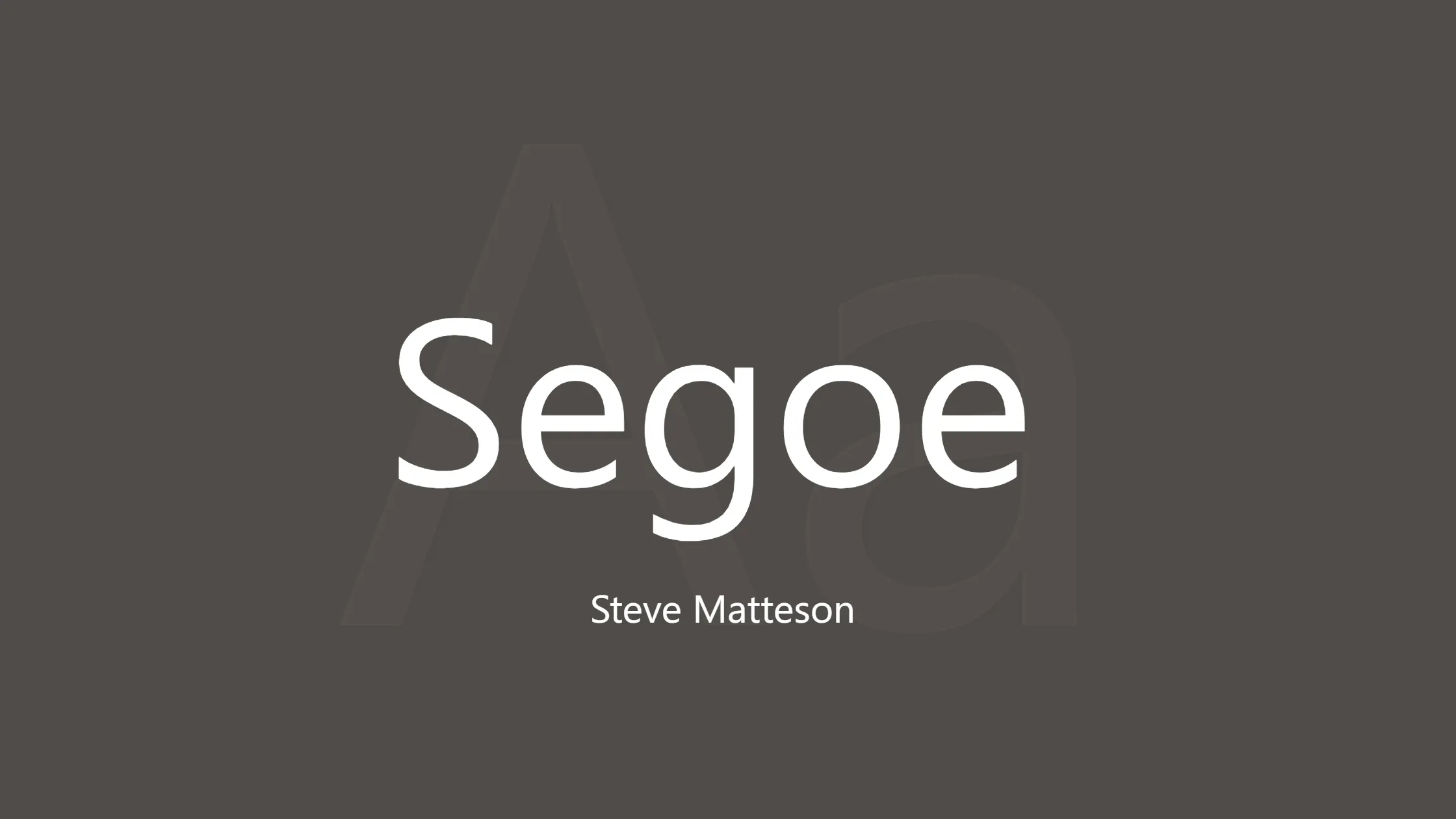
If you’re looking for a versatile and modern font to enhance your PowerPoint presentation, Segoe UI might just be the perfect choice for you. This friendly and easy-to-read typeface is designed specifically for use in user interfaces, making it an excellent option for on-screen readability in your slideshow.
With Segoe UI, your audience will have no difficulty following your message, thanks to its clear and legible style. Plus, it’s a default font in Windows and Office products, ensuring compatibility across computers and devices.
So, why not give Segoe UI a try in your next PowerPoint presentation? You’ll find it not only elevates the aesthetic appeal but also brings a sense of professionalism and clarity to your content.
Franklin Gothic Font
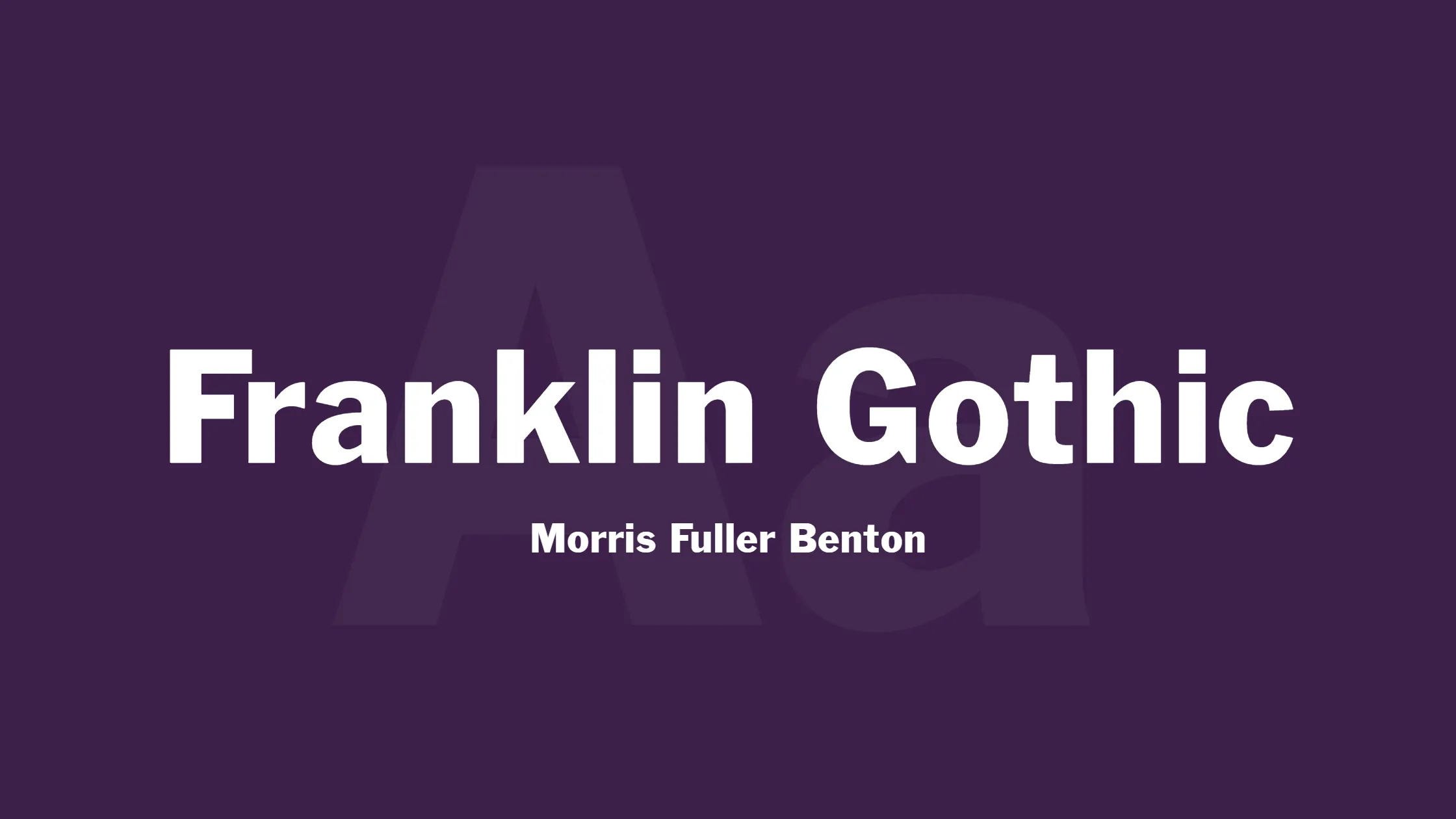
Experience the elegance of the Franklin Gothic font in your next PowerPoint presentation. This classic and versatile typeface is a great choice for adding a touch of sophistication to your slides while maintaining a friendly and inviting tone.
No need to worry about legibility with Franklin Gothic – its clean and easily readable design ensures your audience can focus on your message, whether it’s used in titles or body text.
So why not give Franklin Gothic a try in your next presentation to keep things interesting and stylish, while still communicating your key points effectively? Your audience will appreciate the professional yet approachable feel it brings to your slides.
Candara Font
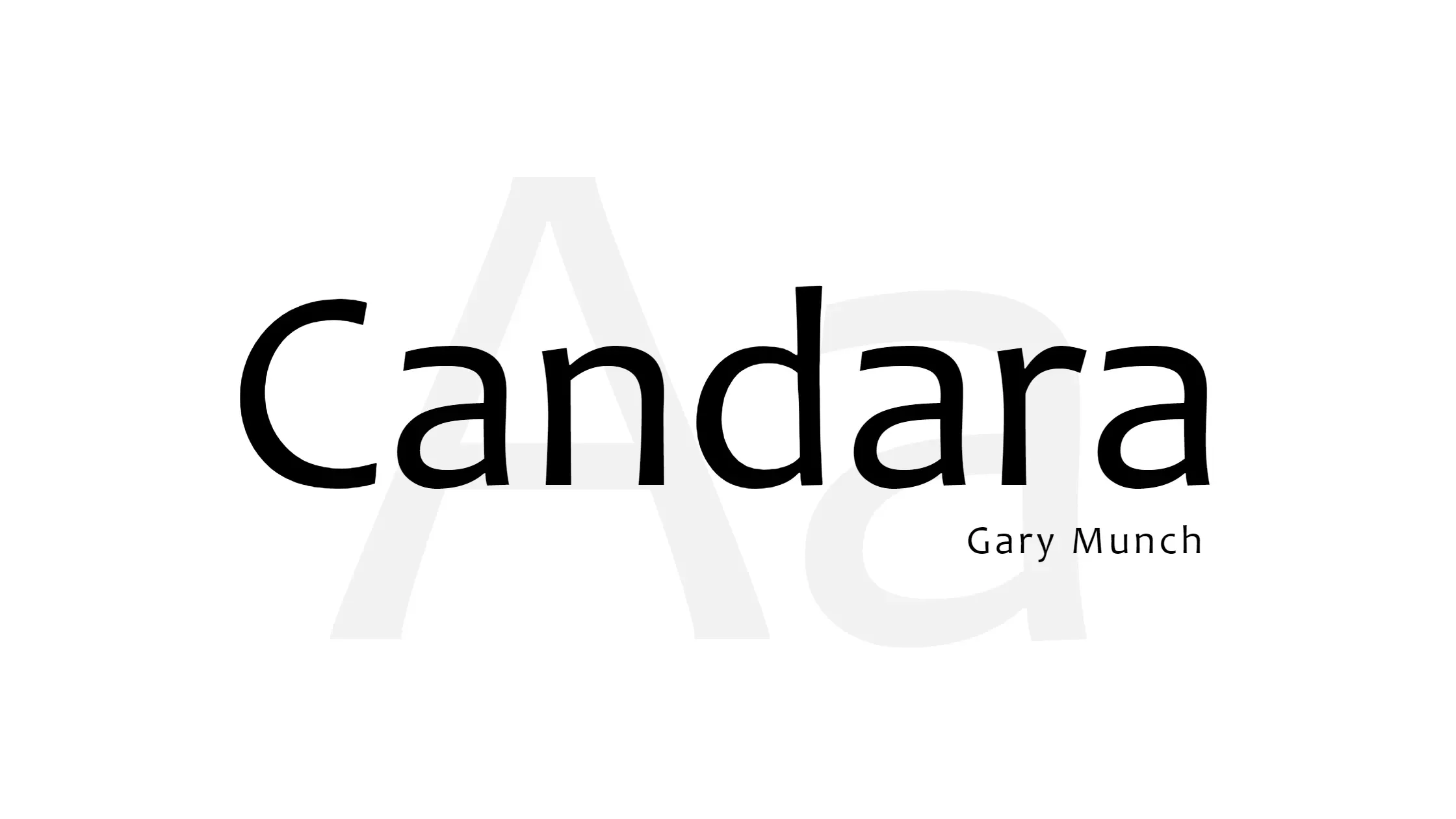
Looking for an appealing font to elevate your PowerPoint presentation? Consider using Candara. This contemporary sans-serif typeface adds a friendly and modern touch to your slides. With its slightly rounded corners and distinctive shapes, Candara is easy on the eyes and perfect for enhancing your content.
To make the most of Candara, use it for both headings and body text. Its legibility and style make it suitable for various sizes and purposes. As a result, your presentation will have a cohesive and professional appearance that captivates your audience. So, next time you’re designing a PowerPoint, don’t forget to give Candara a try. It might just be the perfect font for your presentation needs.
Lato Font
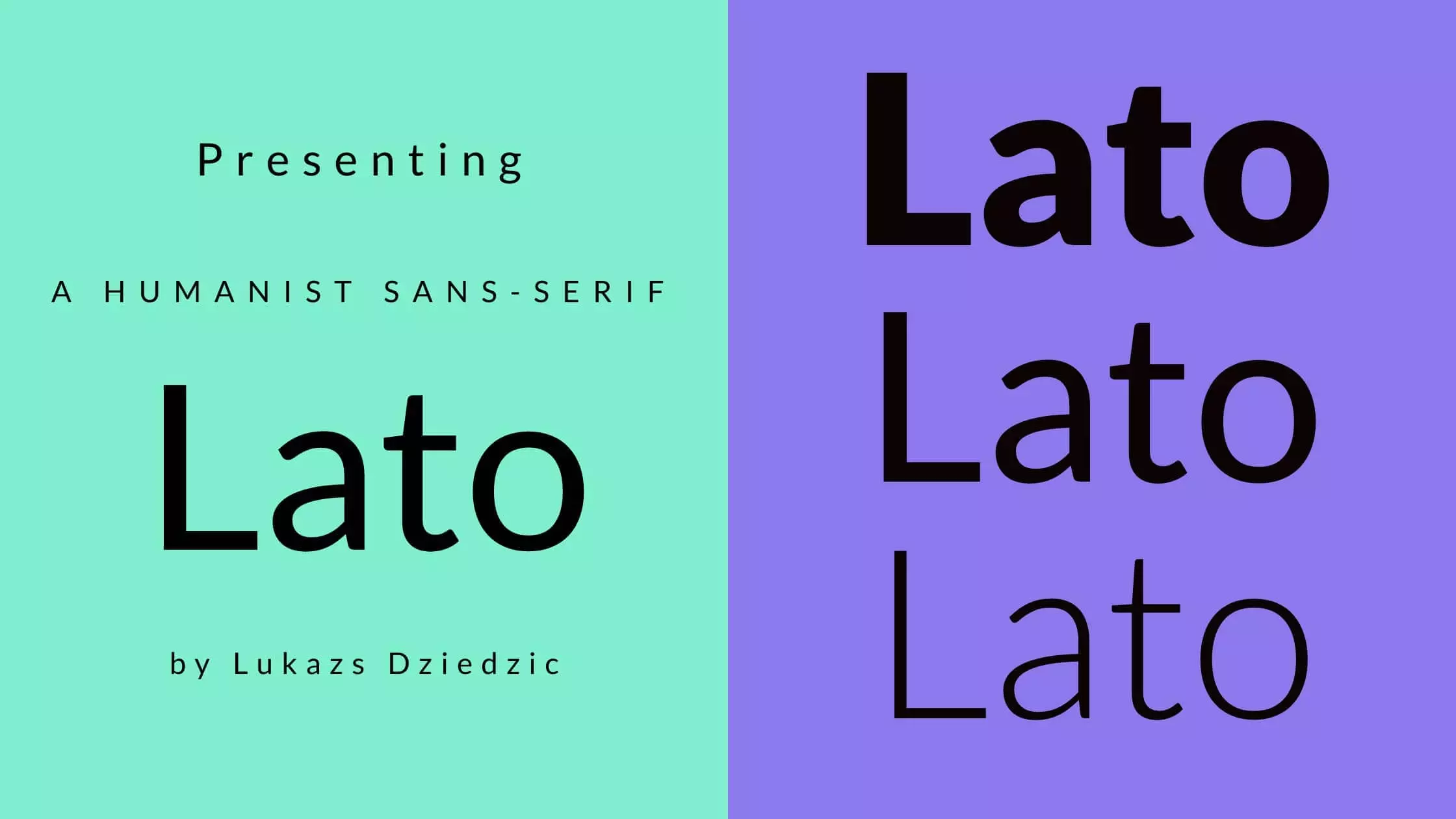
Lato is a versatile font choice for your PowerPoint presentations, offering a clean and modern look that is perfect for capturing your audience’s attention. Lato is a versatile font that offers many different weights and styles, making it perfect for creating polished and easy-to-read presentations. With Lato, your audience will have no trouble reading and understanding your message.
When using Lato in your slides, you can seamlessly adjust the font size and weight to emphasize key points or create a visual hierarchy in your text. This helps guide your audience through your presentation, ensuring they get the most out of your content. So, the next time you’re crafting a PowerPoint, give Lato a try and watch your presentation come to life.
Choosing font pairings for PowerPoint: complementary combinations
Enhance your presentations with these complementary font combinations. By selecting the right pair, your slides will look professional and impactful, without overpowering your content.
1. Opt for Classic and Timeless: Combine Helvetica and Georgia for a clean look that communicates stability and professionalism. Helvetica can be used for titles and headers, while Georgia works well for subtitles and body text.
2. Add a Touch of Elegance: Pair Montserrat and Lato to create a visually stunning presentation. Montserrat has a vintage feel, and Lato offers great readability at smaller sizes.
3. Create a Futuristic Vibe: Exo and Web Server off make a striking combination. Exo’s bold and modern design matches the techy feel of Web Serveroff, enhancing science or tech-focused content.
4. Embrace the Fun and Casual: Mix Pacifico and Junction for a laid-back and lively atmosphere. With their unique and hand-drawn qualities, these fonts add a human touch to your presentation.
5. Choose Charitable and Playful: Bring a warm and friendly vibe using Cabin Sketch and Source Sans Pro. These fonts work perfectly for nonprofit and charity-related presentations due to their playful and creative feel.
Remember to keep it simple and maintain contrast between the fonts for maximum impact. And don’t be afraid to experiment – sometimes, using the same font for headings and body text can create a visually appealing and cohesive result.
Avoiding common mistakes: overly complex or decorative fonts
Steer clear of overly complex or decorative fonts in your PowerPoint presentations to ensure readability and clarity for your audience. Instead, opt for simple, clean fonts like Helvetica and Futura. These versatile, easy-to-read typefaces are perfect for headlines, bullet points, and body text, allowing your message to shine without distraction.
Remember, when it comes to using fonts, less is more. Stick to one or two complementary styles for a cohesive look, and keep font size large enough to be seen by everyone in the room. By keeping your font choices simple and clear, you’ll create a professional, effective presentation that gets your message across with ease.
How to Choose the Right Font for Your Design Style and Personality
Choosing the right font for your design style and personality is crucial in creating a lasting impression. To pick a perfect font, consider these steps:
1. Identify your purpose: Clarify whether the font is for headings or body text, as different fonts convey different messages.
2. Serif or Sans Serif: Understand that serif fonts suggest tradition and intellectual weight, while sans-serif fonts convey modernity and sleekness. Choose what fits your brand’s voice.
3. Familiarity vs. uniqueness: Decide if you prefer a popular, familiar font or a more unique, memorable option.
4. Test and experiment: Feel free to combine different font styles and test their impact on your design to find the ideal font for your presentation.
Conclusion: Your font choices can make or break your presentation
In conclusion, the fonts you choose for your PowerPoint presentation can greatly impact the effectiveness of your message. With so many options available, it’s essential to select fonts that are easy to read, professional, and engaging for your audience. Remember, a well-designed slide deck can leave a lasting impression and help convey your message more powerfully.
So, it’s time to step up your game and explore beyond the overused default fonts. Keep it simple yet captivating, and experiment with various combinations until you achieve the perfect balance. By doing so, you’ll ensure your PowerPoint presentations stand out and leave a positive impact on your audience. So go ahead, choose wisely and make every presentation count!

