Product Sans Font
Google uses a font called “Product Sans” for its branding and various services’ logotypes such as Maps, Drive, News, and Earth. This font is a contemporary geometric sans-serif typeface created by Google for branding purposes.
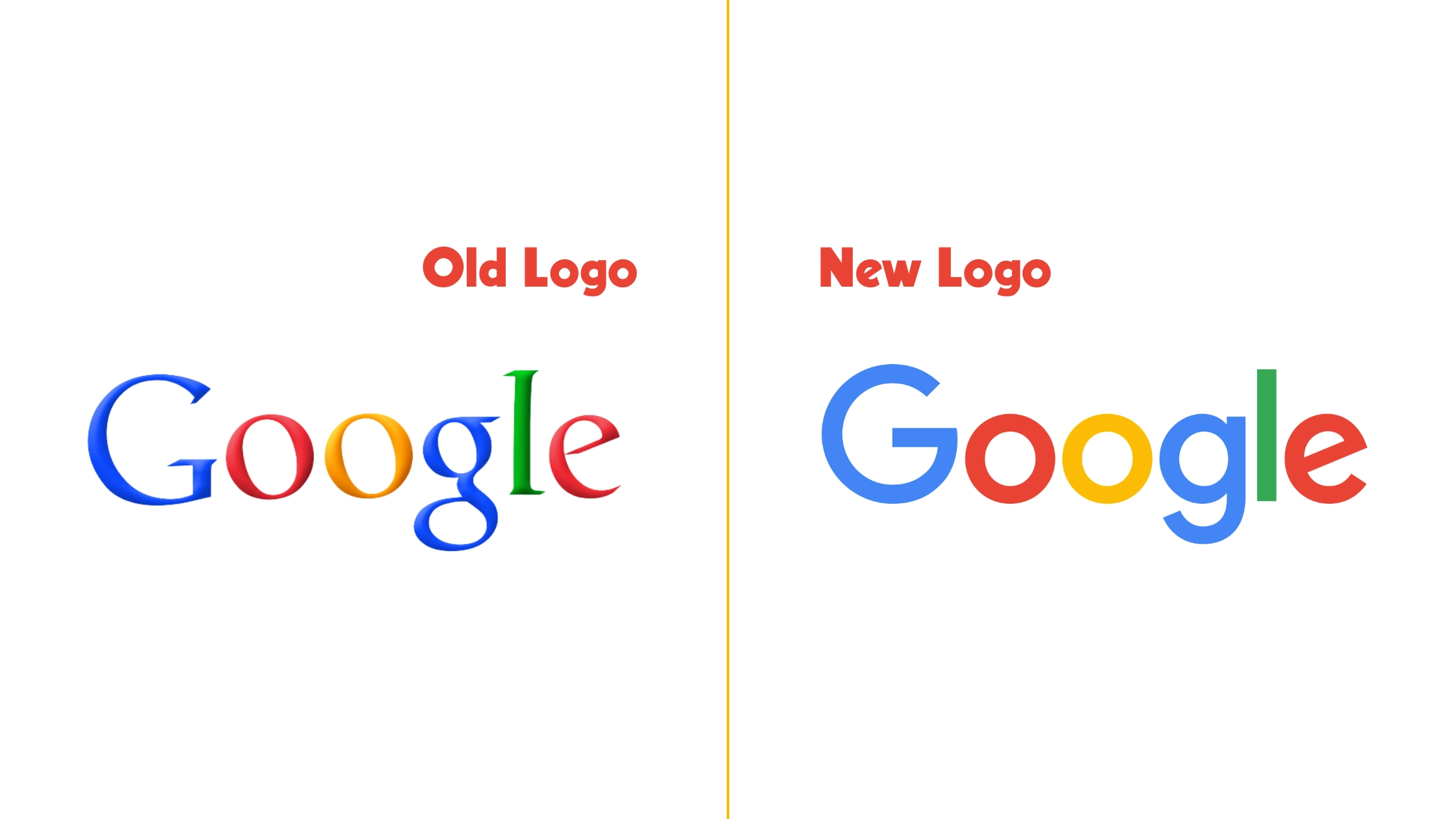
It replaced the old Google logo on September 1, 2015. The design team wanted to retain the simple and approachable styles in previous logos but also include geometric forms.
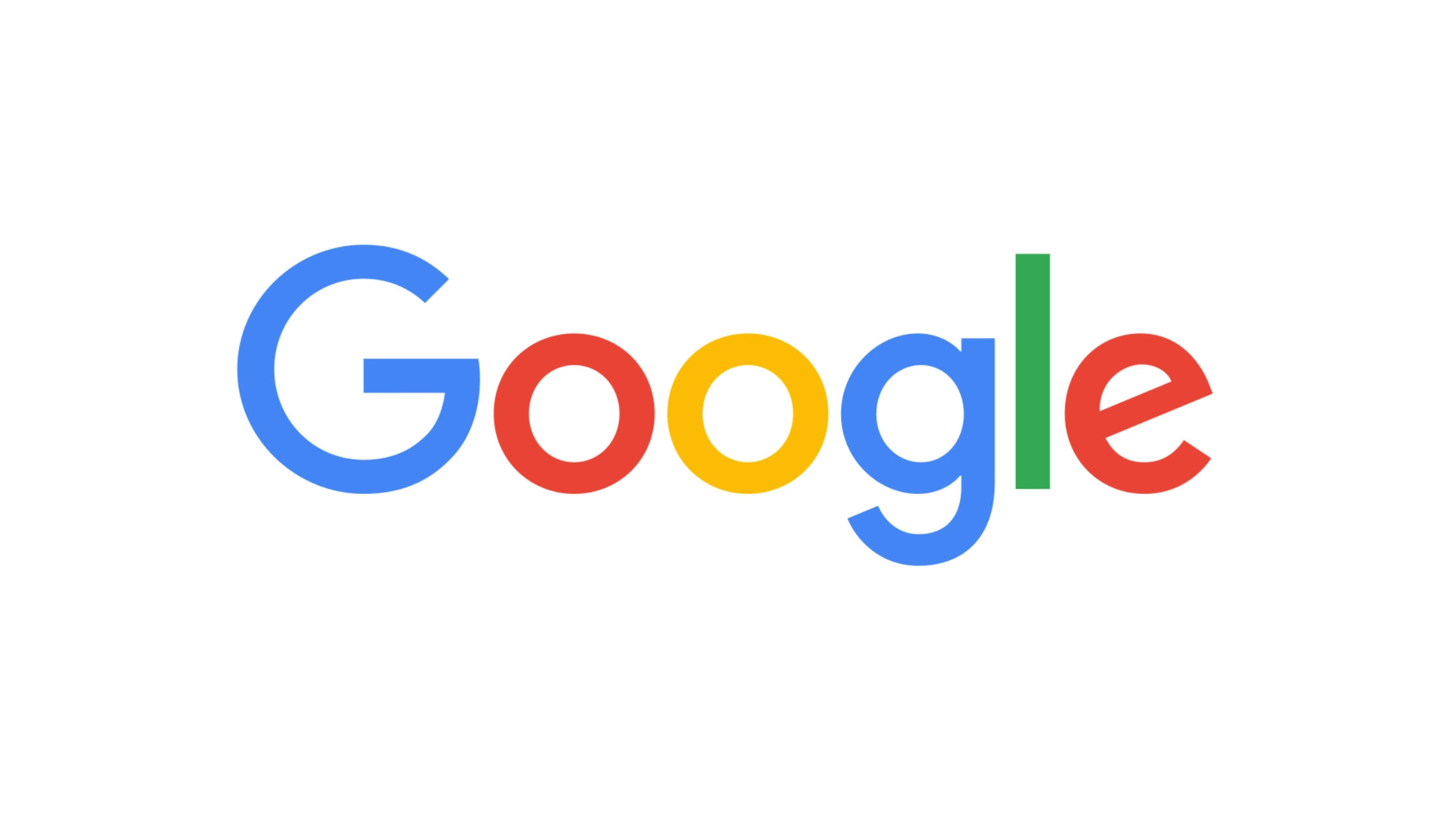
Product Sans is mainly used in the text of Google’s numerous services’ logotypes, and it is also used on the Google Store and in some versions of Android. The present Google logo is based on Product Sans. Slight modifications do exist in the logo compared to the typeface.
Product Sans is proprietary and was not released under an open-source license.
Google Font Generator
Impact on Branding and User Experience
When Google adopted Product Sans, it wasn’t just about changing the looks. It was a smart move to improve Google’s branding and user interface. Now, you can see the same font in the Google Search bar and the Google Assistant logo, giving you a sense of trust and simplicity.
They even use it in website headers, app interfaces, and promotional materials to make their presence even stronger in the digital world.
John Smith, who is a type designer and author, points out that Google’s decision to create a custom font is a clear indication of how crucial typography is in digital branding. According to him, “Product Sans” sets a new benchmark for consistent and easily recognizable design throughout their wide range of products.
Characteristics of Product Sans Font
Product Sans is a contemporary, geometric sans-serif typeface. Google created it for branding purposes. It focuses on simple, approachable styles and geometric forms.
The font has clean lines and open curves. Its geometric forms are inspired by “simple shapes,” the same concept behind Google’s original logo.
Product Sans was carefully designed to visually match the multicolored ‘G’ in the logo. Its characters have a consistent stroke width that adds cohesion across Google’s various platforms and services.
Alternatives to Product Sans Font
While Product Sans is a proprietary typeface not broadly available for public use, several alternative open source fonts convey similar characteristics.
- Roboto: Also created by Google, Roboto is the core font used across most Android devices and Google services. It offers a more mechanical skeleton and largely geometric forms.
- Open Sans: Yet another Google creation, Open Sans is widely recognized for its open forms and neutral yet friendly appearance.
- Montserrat: This font offers versatile weights and styles with a similarly geometric approach to letter design.
- Circular: Used by brands such as Spotify, Circular carries a geometric sans-serif design that echoes the modernism Product Sans is known for.
Google Logo Font Before and Now
Before the introduction of Product Sans, Google’s logotype mainly used a serif font called “Catull.” The earlier font had distinct serifs and contrasting stroke weights, which gave it a classical web style from the early 2000s.

But then, on September 1, 2015, Google made a shift to Product Sans. The goal was to achieve a more modern and friendly look, symbolizing the brand’s future direction while still keeping its playful and accessible roots in mind.
Learn More: Google Logo Font, Product Sans Font.
Final Words
Google’s choice of Product Sans as its main font reflects its commitment to clear, user-friendly, and approachable design. It balances a playful and friendly tone with simplicity for various applications. Product Sans is not just a typeface but a statement of Google’s values.
Product Sans is exclusive to Google. But, alternatives like Roboto, Open Sans, Montserrat, and Circular convey similar values in typography.
What is the easiest way to install this font on my device?
There’s no reason to be worried. Please follow our directions.
You may also find out more about typography and how it is classified from here.
Please do not hesitate to contact me if you have any questions. Thank you very much!


Leave a Reply