Chirp Font
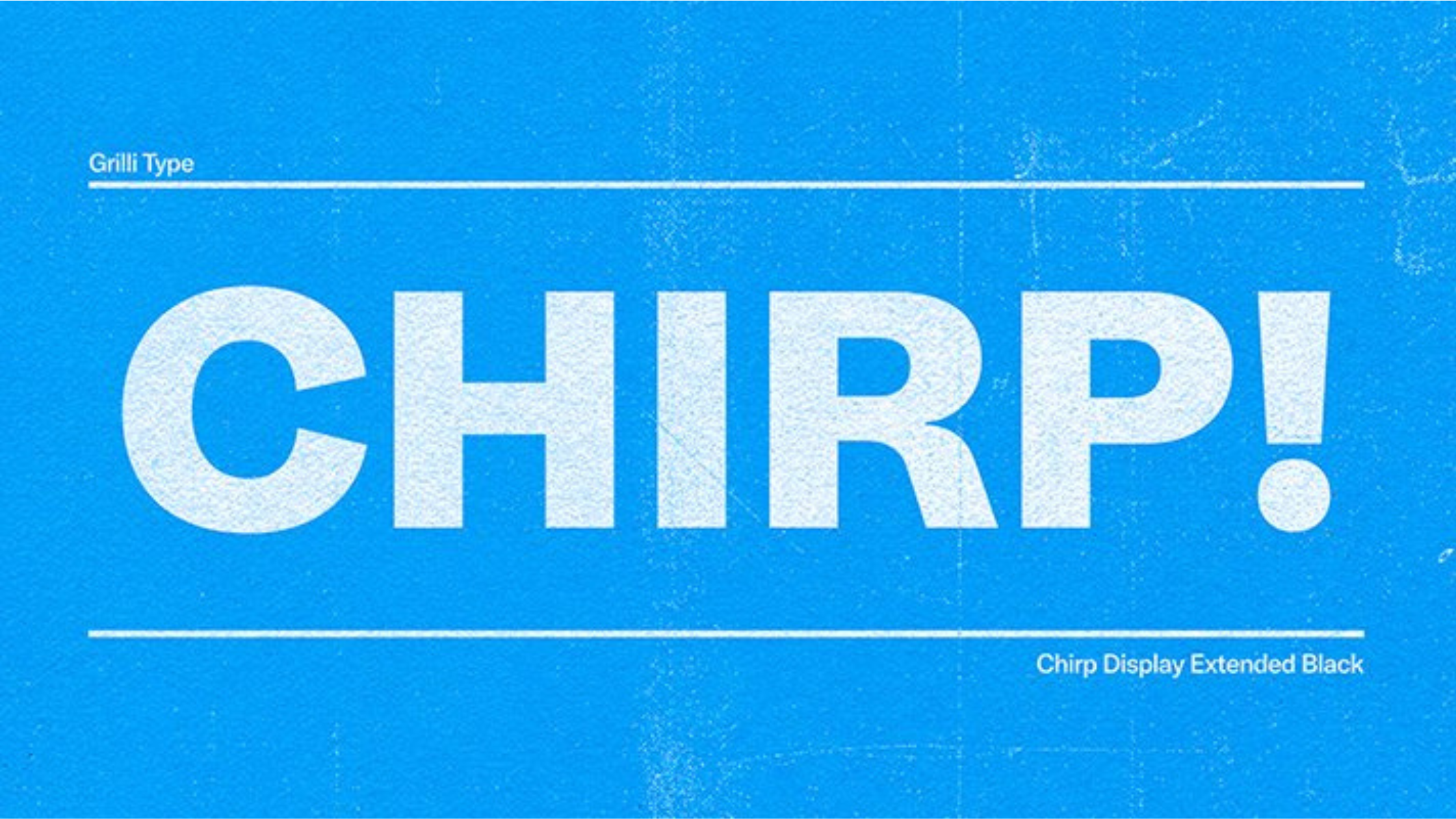
Twitter uses its own custom font called “Chirp” for its web and app versions. This font was introduced in August 2021 and is the company’s first proprietary typeface, featuring over 82 styles.
The Chirp font was developed with the help of the Swiss company Grilli Type Foundry. It replaced the previous fonts such as Segoe UI, Helvetica Neue, and Roboto, which were used on different platforms and devices.
Characteristics of Chirp Font

- Legibility: With clarity at its heart, Chirp is crafted to be read with ease, catering to the rapid-paced reading environment of Twitter’s feed.
- Versatility: Designed to support a diverse global audience, Chirp performs consistently across numerous languages and platforms.
- Optimization for Digital Use: Chirp shines on screen, offering excellent readability across various device resolutions and screen sizes.
Twitter’s transition to Chirp has given it a typographic facelift that reflects its ethos: fast, clear, and open communication for everyone, everywhere.
Here are a few tweets about the new font Twitter uses
As observed by Joshua Benton of NiemanLab, the font remains the same. However, the implementation of OpenType stylistic sets now makes distinguishing similar characters like a capital ‘I’, lowercase ‘l’, ‘0’, and ‘o’ a breeze. A diagonal line atop the zero or the sleek differentiation between I and l is all part of Twitter’s dedication to refining user experience on every pixel of your screen.
Tweet from Derrit DeRouen, Ex-CD, Global Brand at Twitter
“Delving a little deeper into ‘Chirp’, our new typeface – It’s about giving Twitter its distinctive voice. Until now, we’ve built our brand with borrowed alphabets, from SF Pro and Roboto to Helvetica Neue. But in realizing Twitter’s essence lies within 280 character soliloquies, we knew it was time for our own font, our own narrative.”
Fonts used by Twitter: A Closer Look
Here’s a quick tour of the fonts you would find on Twitter across different platforms before.
On Android devices, Twitter chose the crisp and professional-looking ‘Roboto Font‘.
For iOS apps, the font of choice was the distinctive and sleek ‘San Francisco font‘.
Meanwhile, Mac users enjoyed the clean and modern ‘Helvetica Neue font’ on their Twitter interface.
For Windows users, Twitter opted for the universally recognized ‘Arial’ and the contemporary ‘Segoe UI‘ fonts.
All these choices combined to create an engaging and accessible user experience!
Learn More: Twitter Logo Font.
What is the easiest way to install this font on my device?
There’s no reason to be worried. Please follow our directions.
You may also find out more about typography and how it is classified from here.
Please do not hesitate to contact me if you have any questions. Thank you very much!


Leave a Reply